G. Bothun and S. Ostrander Dept of Physics, University of Oregon
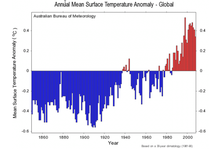
The issue of whether or not humans are inducing significant climate change or merely adding noise to an intrinsically noisy system remains to be clearly resolved, precisely because the data that defines the climate system is noisy. Recently, many climate change blogs have issued the statement: Global Warming Stopped in 1998. That sentiment derives largely from the visual impression of the most recent data on global average temperatures as displayed in the familiar (or infamous) hockey stick diagram. Such diagrams, like the one presented below, apparently show that global average temperatures peaked in 1998 and have been slowly declining since:
The above waveform represents the mean average LAND surface temperature anomaly using a 30 year baseline (e.g. 1961-1990) from which to derive the anomaly (the value on the Y-axis). The last bar in this diagram is for the year 2008. Taken at a prima facie level, yes, the highest amplitude year was 1998 (the same year of a very strong El Nino) followed by a rapid fall off in 1999 and 2000 and then a steady increase to reach the 2005 sub peak, from which the last three years have decreased amplitude.
But how seriously should this kind of data/diagram be taken as either evidence for or against "global warming"? Before presenting alternative waveforms that likely better represent the situation, let's take a step back and objectively ask if there is much value in the hockey stick methodology. Among the many potential problems are the following:
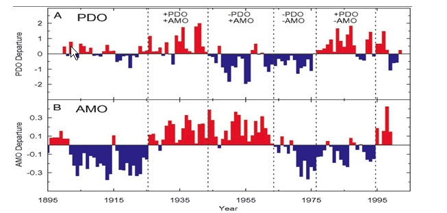
Here, we focus only on the first point above - the instability of the climate baseline. The figures below, constructed from data available at the National Climatic Date Center, show the two principle sea surface temperature (SST) multidecadel oscillations that have been empirically determined (the physical cause of these SST oscillations is not yet understood though many theories exist). The two oscillations are known as
As clearly seen in the Figure below, these two oscillations are not in phase and thus allow for 4 different combinations (+PDO,+AMO),(-PDO,-AMO),(+PDO,-AMO),(-PDO,+AMO) to occur over a century timescale. This might argue that your climate baseline should be 100 years long and not 30. We will employ that definition of climate baseline soon.
The Figure below depicts the precipitation conditions of the United States as they manifest themselves in these 4 phases of climate drivers. This figure is generally nowhere to be found in dicussions about climate change but it clearly shows that the national climate pattern, as defined in terms of precipitation, is clearly very sensitive to the relative PDO and AMO phases. In essence, the US has 4 different climate periods when looked at on century timescales. Currently we are in a phase of +PDO +AMO which generally results in sustained droughts throughout the Western United States and the northern states of the Great Plains. Drought is also seen in much of the American Southeast as well. Climate data since 2000 confirms persistent drought in these locations.
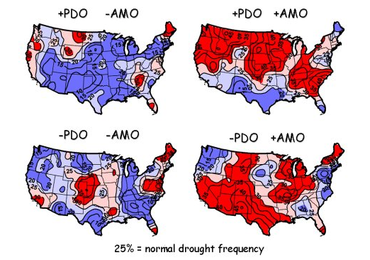 Clearly the United States has a large variation around any "average national climate".
One way to reduce the effect of baseline noise or baseline features is to use the combined Ocean + Land data as ocean temperature anomalies are less sensitive to baseline variations. That data is shown in the figure below. Of particular relevance in this figure is that the 1998 peak is relatively suppressed and there does not appear to be a noticeable down turn in recent years compared to the corresponding figure for Land data only. So the qualitative visual impression of recent trends in "global temperature" changes a bit if one considers the Land + Ocean data as opposed to the Land only.

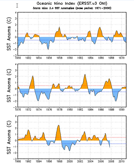
Of course both Land and Ocean temperatures are also influenced by El Nino/La Nina cycles and within a particular AMO,PDO phase, there can be several such cycles. As shown in the figure below (which uses a baseline period of 1971-2000) there have been between 15 and 17 individual El Nino cycles since 1950. Each cycle has a different duration and the time between cycles is not uniform. In general, an El Nino cycle occurs every 3-5 years but the behavior of the system in the early 1990s is particularly odd as there was a 5 year period of essentially continuous (but weak) El Nino with no La Nina event in between. Note that this year, 2009/2010, is currently in the strongest El Nino cycle since the 1997/98 event. Again the point of raising the El Nino/La Nina cycle is to show that we have a secondary timescale involved in our climate baseline.
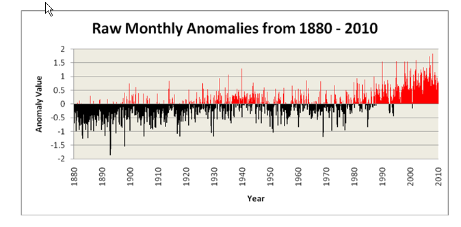
 Finally we present here, perhaps for the first time, a new waveform for global average temperatures. One of problems with using global average temperature is the lack of any real physical meaning to that quantity in the context of actual climate. That is, weather/climate is strongly seasonal in its behavior and while one can find seasonal representations of the hockey stick (as published by the Hadley Centre in Britain), what we present below is a plot of monthly anomalies where the anomaly is defined against the 100 year timescale of 1901-2000.
We begin by showing just the raw data which is current as of February 2010. Each plotted column represents one month. This representation is not very informative but does contain two interesting pieces of information:
 The most meaningful representation of the data likely comes when one smoothes the data and in the case represented below, the monthly anomalies are smoothed over an El Nino/La Nina cycle.
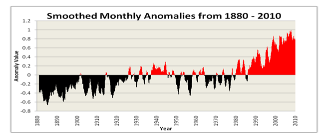
When represented this way, it seems clear that the El Nino/La Nina cycles are superposed on a steadily increasing slope that commences somewhere in the 1980-1985 period. The claim that global warmed stopped in 1998, as applied to this diagram shows that it also stopped in 1982, then again in 1985, and then in 1991, 1998, 2001, 2003, and 2008. In other words, we see continuous evidence of "mini-peaks" (or local maxima in the parlance of time series language) in the anomaly data which are simply smoothed over and missed when one plots annual data.
The current period is most likely a local minimum with respect to the last peak and one just need wait another 12 months or so, when we will return to increasing global monthly anomalies which then will be about +1 degree C in amplitude. Note finally that this data is using a 100 year baseline which is serving to somewhat suppress the actual amplitude of the positive residuals. The main point of this article, however, is not to determine the statistically best way to define the maximum amplitude of global rises in average land temperature, but rather to point out the significant fluctuations in the baseline due to the 4 phase AMO/PDO system and the El Nino/La Nina cycle will cause local maxima and minima in any time series data involving average temperatures
On the basis of this data it would seem that we oscillate between a local maximum and a local minimum (on timescales of a couple of years) while the underlying trend is upwards and certainly not downwards. Consistent with that conclusion is the recent data from NOAA and NASA that March 2010 was the warmest March every within the time period shown above. When other factors are considered on the future amplitude of temperature increases, such as the water vapor feedback loop and the methane release of the Arctic permafrost, the argument that global warming peaked in 1998 will prove to be both erroneous and silly.