All figures and the like come from this very recent report, which is doing exactly the right thing - using data in the
real world. A total of 278 projects have been evaluated.
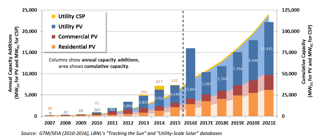
- More and more projects new use tracking (of the sun)
- Increasing number of "utility scale" (generally defined as more than 5 MW in this case so its not the same "utility scale" has for power plants in general - that scale is more like 500 MW).
Like the PTC for wind, there is the ITC (Investment Tax Credit) for solar. This was scheduled to expire at the end of 2016 but
that was revamped in late December of 2015. Because of this uncertainy, there is a spike of expected (and mostly real now) deployment in the year 2016, before the ITC expired (which now
is not going to happen but that could change again.
The first set of figures refer to PV facilities and the second set of (similar figures) refer to CSP facilities
PV Facilities:
Locations of Utility Scale PV Projects
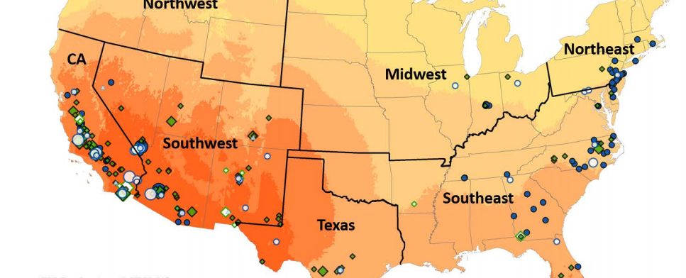
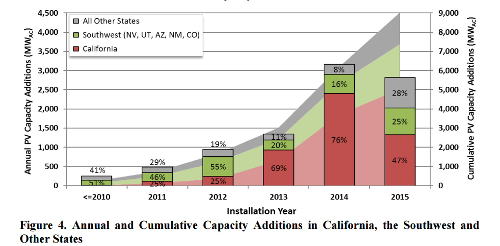
But California Installations dominate
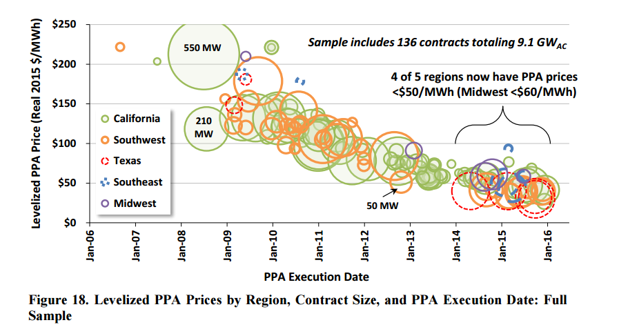
This is very encourgaging: installed prices have come down
-
AC Median price in 2008 = $6.50 per watt (not competitive)
- AC Median Price in 2015 = $2.70 (this is competitive)
- About 1/4 of the projects came in at $1.70
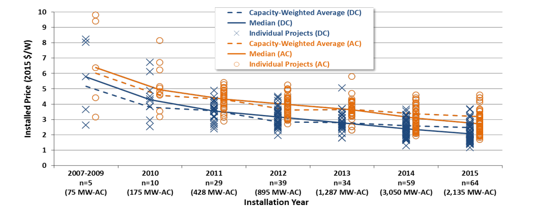
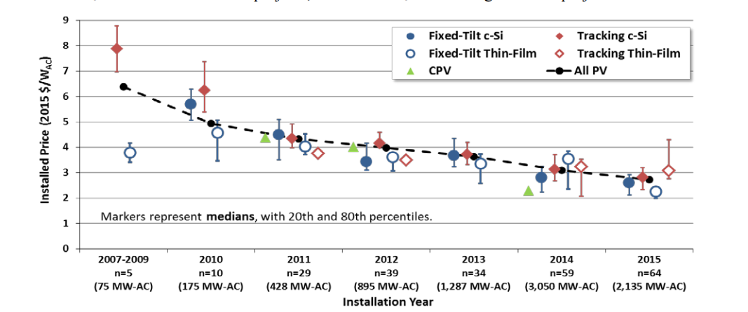
This decline seems mostly independent of Technology choice for Solar
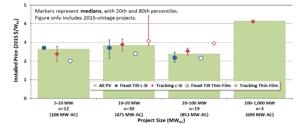
However, our analysis (also consistent with this report) shows that economies of scale in pricing don't yet exist. This is baffling.
From the Report:
From our ongoing research
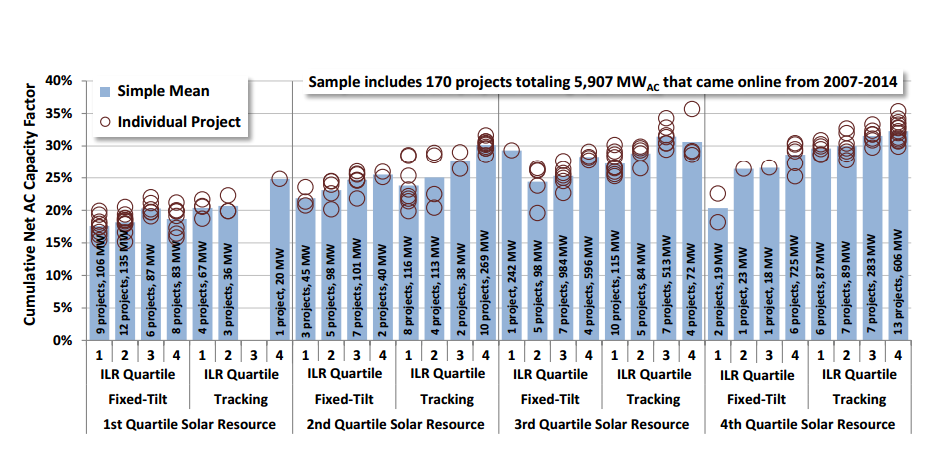
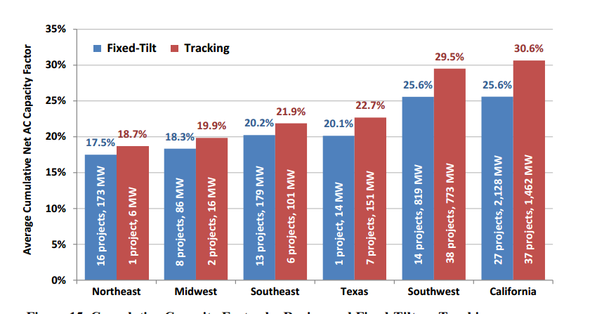
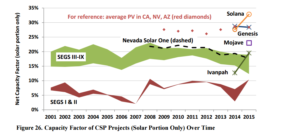
In general, just like our report on wind, it is important to determine the capacity factors of these facilites. But for solar, capacity factor is a lot more complicated that wind because it depends on
- weather directly, cloudiness, atmospheric transparency (i.e. dusty skies in an arid environment are a problem) as this detemines how much solar irradiance reaches each panel.
- Is the array fixed or does it track? (tracking arrays should have higher capacity factors)
- The actual efficiency of the the panels for a PV facility and this has increased a bit over time
- The optical "engineering focus" efficiency of troughs and towers (how much energy in the reflected sunlight gets to the concentrator?)
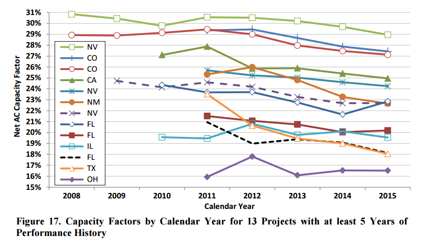
- Peformance degradation of the components over time.
The figure below shows that the capacity factors are:
- exhibiting a very wide range fomr 15 to 26%
- Have an average of about 26%
- That capacity factor is less than wind (wind is now about 35% in the US)
- Capacity factors of as high as 50% could be achieved by optimal solar plants. The real world is far from that
The role that weather plays is clear here
Some degradation is also evident (not surprising)
More good news - PPA (power purchase agreements)prices have fallen a lot
CSP Facilities: The report focuses on 16 new porjcts that total about 1800 MW. Build out of CSP projects has been slow:
After some projects (Kramers junction CA) were built in late 1980s and early 1990s there was a 16 year lull
64 MW Nevada Solar one was then built in 2007
In 2010 a 75 MW facility was build in florida in 2010
| 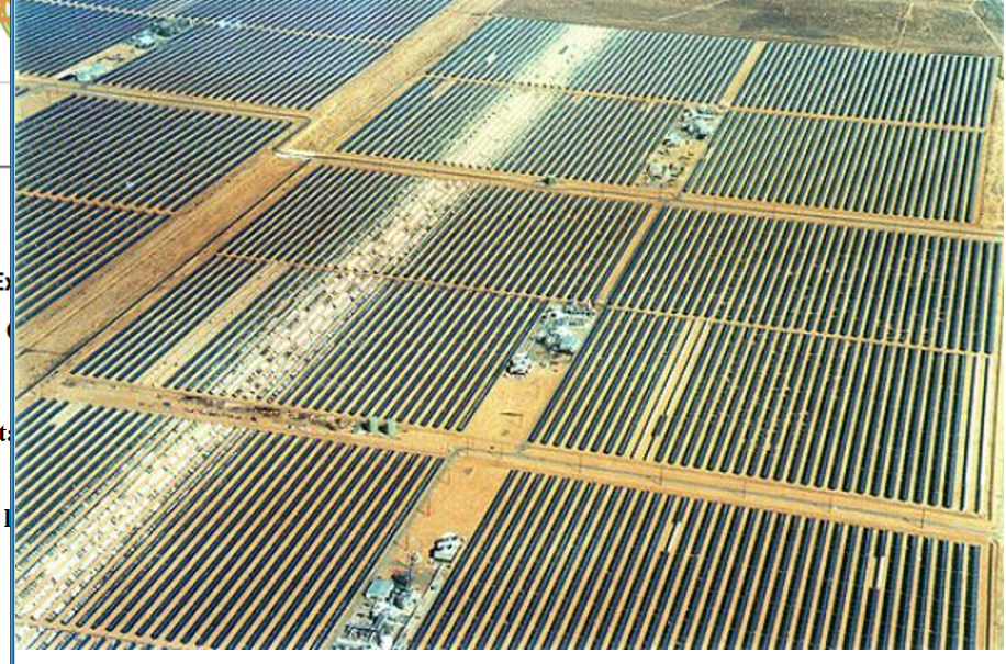 |
The current flurry of activity started in 2013 with facilites now being built at > 200 MW in various places in CA, AZ and NV. | 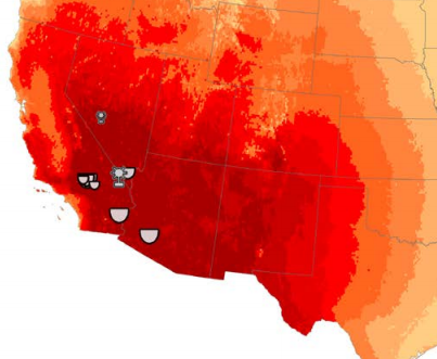 |
Although costs and PPAs for CSP facilities are quite similar to those previously shown for PV facities, there are real issues with the empricial capacity factors, particulary for the Ivanpah facility (again, question in homework 2 for you to research)
|