First Homework Assignment:
This assignment two parts. In red text are items that you need to do
related to that part.
Part I:
Download this excel spread sheet that contains
the relevant data
This data file contains two relevant entries:
- Column C is the year
- Column D is the observed annual temperature for that year in units of degrees F
The following graph shows "the answer" you get from analyzing this data.
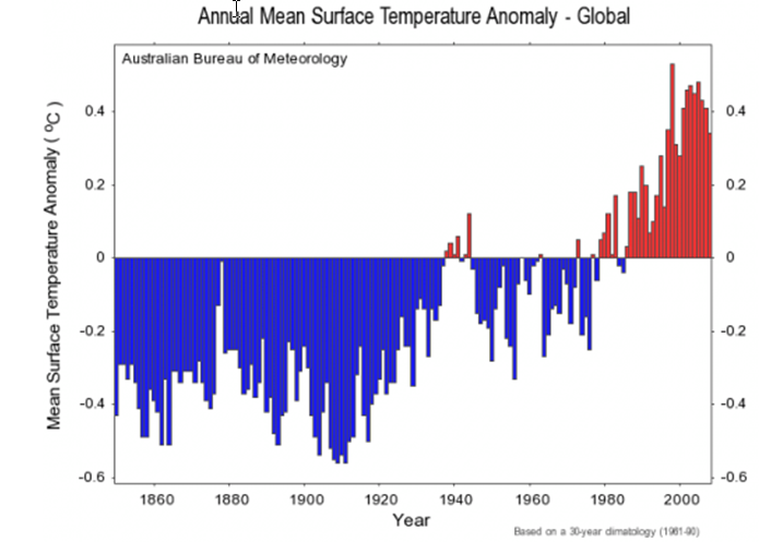
What is plotted here is not the absolute temperature, like you are given in column D, but instead
is the temperature anomaly.
The anomaly index refers to a baseline. So, for instance, supposed you define your
baseline as the temperature in year 1950. Then you simply subtract the 1950 temperature
from any year to get the difference, which is the anomaly. In practice, 30 years of
data are used to defined the baseline (so you average 30 years worth of data to get
one baseline temperature that you use to subtract from the individual years temperatures).
The plot shown above uses 1961-1990 as a baseline.
Procedure:
- Produce two plots: one that plots the temperature anomaly using the 1961-1990 baseline and one
that uses the 1900-2000 time period to define the baseline average.
- For both plots, use linear regression, starting from the time period that you believe you begin
to see temperature anomaly rises, predict what the temperature anomaly will be in the years 2025 and
2050.
- Using the dispersion in the linear relation calculate the 95% confidence intervals (e.g. +/- 2 dispersion
units) on your
predicted temperature.
- Calculate the chi^2 statistic for both of your linear regressions. Make sure you include your
work on how you calculate the statistic following the dice example done in class.
- Write a brief argument on which baseline should be used to most "properly" represent the data.
Download this excel spread sheet that contains
the relevant data
This is a monthly temperature record for Central England that goes back to 1659!
Units are degrees C.
You will treat this data similarly to what you did in Part I but with a different emphasis.
- In this case we want to deal with seasonal data. Define Winter as November thru February (i.e.
4 months) and summer as July and August (well it is the UK). Produce temperature anomaly graphs
using what ever baseline period you want for winter and summer. Make sure you state and defend your
choice for baseline.
- Use linear regression on that data to find the best fitting linear relations (over the time period
that you think is best fit by a line).
- Using the observed slope of the line determine the trend in units of degrees
C increase per centure for the Winter and Summer data.
- Which of these two seasonal representations of the data do you believe contains the strongest signal of warming
and why is this the case. Make your arguments in terms of a) the dispersion in the relation, b) the error in the
slope, and c) the waveform of the data.