Introduction to Statistical DistributionsWhy do we care about statistical distributions:
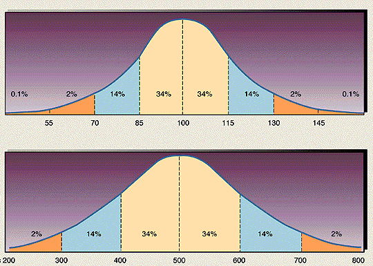
Statistical distributions are important because:They provide a quick, visual overview over how your data are distributed in terms of frequencies (how many times did a given value of x occur?). Therefore, a frequency distribution for any data set should be plotted. A very useful way to plot a distribution is given at http://www.shodor.com/interactivate/activities/Histogram/.The shape of your distribution intuitively tells you how well the average (or mean) value of the data is determined and the degree of variability around that average. One can, of course, formalize this in terms of means and standard deviations which we will later do. In reality, this distribution is known as a probability density function, and its main scientific use is to be able to ascribe probabilities to events occurring. For instance, a 100 year flood event is defined by some statistical distribution of annual flood levels of some river – from that distribution you can calculate the 1% flood level (e.g., 1 in 100 years). The example probability distribution shown above is called a normal distribution (or a Bell Curve), and it fits many events in nature quite well. In a Bell Curve, the mean, median, and mode all occur at the same value of X (x=500 in the above example). 50% of the data lies above the median/mean in this case and 50% below it. The Bell Curve above is further divided into probability units, which we will discuss in detail later. For now, suffice it to say that 68% of the data is contained within +/-1 standard deviation about the mean; 96% of the data is contained within +/-2 standard deviations about the means and 99.9% of the data is contained within +/- 3 standard deviations. In the example above, the standard deviation is 100 units. So the probability of obtaining a value of X larger than 700 is your randomly sample this distribution is 2%.
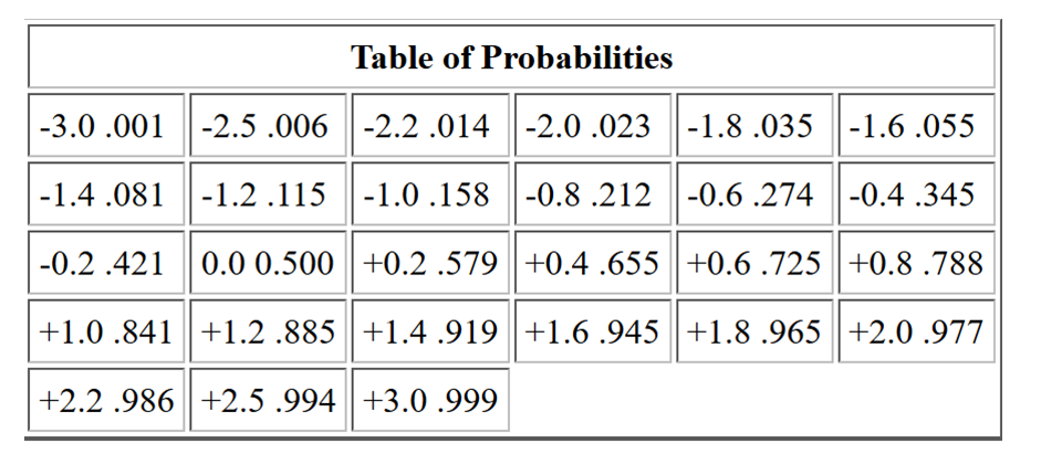
For example, if you are a San Antonio Spurs basketball fan and after the first 40 games of the season the team averages 102 +/- 8 points per game then you can say the following: The probability that the team will score more than 118 points in a game is 2% since the mean + 2 s contains 98% of the area. A more exact table of probabilities is given below
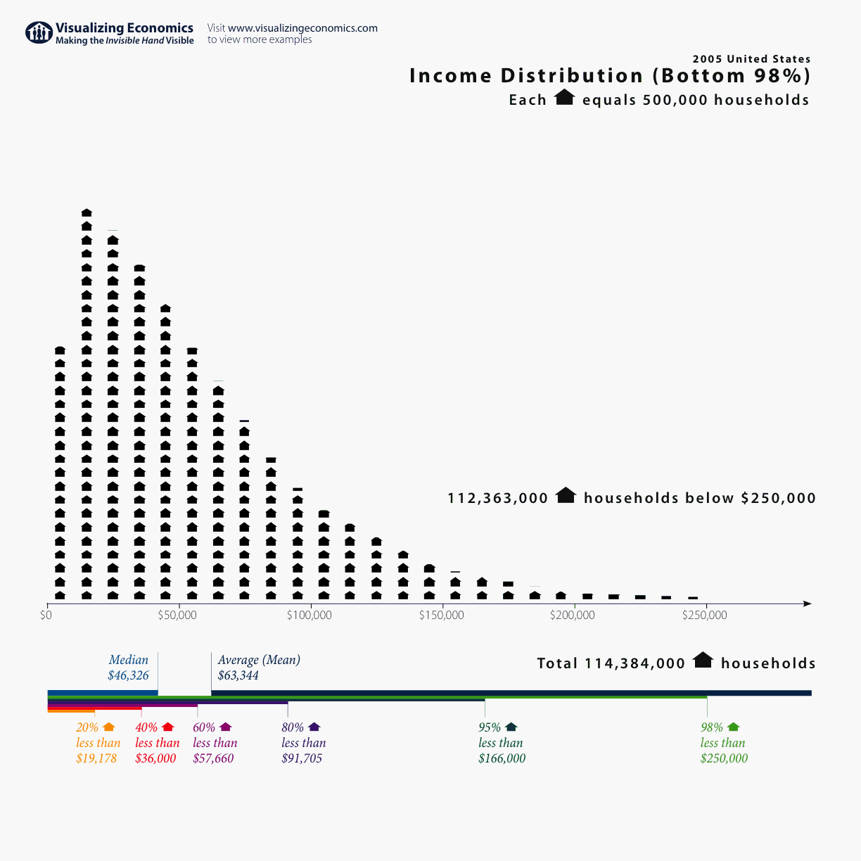
Plotting the distribution of the data can also easily show cases where the distribution is said to be skewed. In skewed distributions, the mean and median values are not the same. In the case of large skewness, there can be a substantial difference between the mean and the median, such as to render the use of the average (mean) value quite misleading. Here is a good example of a complicated distribution where there is lots of power in the tail. This kind of distribution renders the concept of "average" to be quite vague and meaningless because the average is being heavily influenced by the high income tail.
In general, simply looking at the distribution with your eye, when plotted in a suitable manner, contains a lot of information.Even simple statistics can characterize most sampling in nature because, to first order, the probability density function (i.e., the data) is well represented by a normal distribution, when the variable is a continuous one (i.e., not counting). Counting approaches normality when the number of counts, N, is large. For most cases, N > 30 can assure a normal distribution. Most importantly, statistics have predictive power.
Distributions:When you form a sample, you represent that by a plotted distribution known as a histogram. A histogram is the distribution of frequency of occurrence of a certain variable within a specified range. An example histogram is shown below:
 In general, these statistical approaches are valid as long as the sample data has been randomly obtained. The issue of randomness, however, is non-trivial. For example, suppose your data science task is to analyze the distribution of tree diameters in some forest so as to make harvesting and re-planting decisions. You have some grant money that you can hire a research assistant to acquire the data. The research assistant goes into the forest and gives you measurements for 100 trees. How do you known that the data is random, representative and reliable? For all you know, the data is completely made up. Therefore data verification is essential and this is again where domain knowledge is helpful. To insure a reliable data set, these are the kinds of instructions that the data scientist should have created to carry out the experiment:
An example of the histogram process. (You can cut out this data and paste it into the interactive histogram applet linked above.) Here is some data. (As you can see, just looking at the numbers in this table doesn't tell you a lot – can you identify the mean value just from looking at the numbers in the table?)
62.653 63.375 63.241 63.574 62.061

61.010 49.314 56.207 61.152 56.125

57.055 56.162 63.174 59.219 60.983

56.327 61.399 64.470 56.693 56.905

66.167 67.443 66.595 55.845 65.250

62.309 64.621 56.444 53.981 57.540

49.154 58.910 59.146 68.144 59.853

58.584 61.382 60.999 51.388 58.044

58.041 65.309 56.949 62.992 54.460

59.850 56.871 56.909 60.206 58.425
To construct a histogram you would count the data in intervals. The above data table is just a snapshot of a larger data set that involves 1200 individual measurements of tree ring diameters. If we count the data in intervals of 5 inches, then we would construct a table that looks like this:
Bin Limits      |  Frequency     |   Proportion

------------------------------------------------

30.00 to 34.99  |       0        |     0.000

35.00 to 39.99  |       0        |     0.000

40.00 to 44.99  |       0        |     0.000

45.00 to 49.99  |      22        |     0.018

50.00 to 54.99  |     147        |     0.123

55.00 to 59.99  |     402        |     0.335

60.00 to 64.99  |     428        |     0.357

65.00 to 69.99  |     185        |     0.154

70.00 to 74.99  |      15        |     0.012

75.00 to 79.99  |       0        |     0.000

80.00 to 84.99  |       1        |     0.001

85.00 +         |       0        |     0.000

-------------------------------------------------

                     1200              1.000
We construct the histogram by plotting the frequency vs. the bin location. This is also known as a bar graph and it's shown here where it is now obvious that the average value for this data set is around 60 (inches).
 This data set appears to be reasonable well approximated by a Bell Curve, also known as the normal distribution curve:
To reiterate: This curve has the following characteristics:
The dispersion (standard deviation) determines the overall width of the Bell Curve. Bell Curve with a Large Sigma (Dispersion)

Bell Curves with Smaller Dispersions

Summary:A collection of data (hopefully randomly sampled) is usually called a sample or a population (of data). From that sample/population one can construct the basic sample/population statistics: The Sample/Population Mean – Numerical measure of the average or most probable value in some distributions. Can be measured for any distribution. Knowing the mean value alone for some sample is not very meaningful.  In general, we map dispersion/standard deviation units on to probabilities: http://zebu.uoregon.edu/2003/es202/ptable.html. For instance:

The calculation of dispersion in a distribution is very important because it represents a uniform way to determine probabilities and therefore to determine if some event in the data is expected (i.e., probable) or is significantly different than expected (i.e., improbable). Later on we will apply this concept directly to global warming data to determine if recent years' warming is significant, relative to some long term trend. (It will turn out to be quite significant and this is something we can prove with simple statistics.) |