Time Evolution of Various GHG Emissions
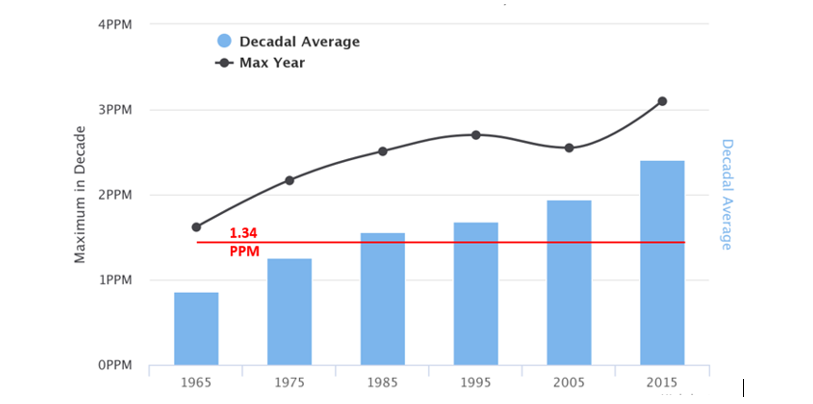
The global impact of any particular GHG will depend on it's a) GWP, b) atmospheric concentration, c) atmospheric lifetime, and d) the rate of its increase in the atmosphere. As previously discussed, some GHGS matter much more than others, but any GHG exhibiting increased concentration over time is of concern. As GHGS have long atmospheric lifetimes they are globally well mixed and so the amount of CO2 over London, UK would be the same as that over Sydney, AU. Figure 5 plots the decadal average of annual CO2 emissions as measured at the Mauna Loa Observatory (http://scrippsco2.ucsd.edu/data/atmospheric_co2/) and shows the maximum emission for a given year in that decade. For reference, the solid red line is the average annual emission over the period 1960-2000 (1.34 ppm). The black dots refer to the maximum emission year in a given decade (2017 set a new record of 3.1 ppm).
Analysis of the Mauna Loa Data set shows:
- The current decadal annual increase in CO2 concentration is 2.41 +/- 0.38 ppm. This is almost twice as large as the 1.34+/- .36 ppm value during the 1960-2000 periods.
- For the current decade (2010), every single year has a larger annual emission than the long term 1960-2000 average of 1.34 ppm.
- For the previous 5 decades, the average annual emission rate is 1.46 +/- 0.42 ppm. This decade's current value of 2.41 is 2.26 standard deviations larger than the previous decadal value. This increase has only a 1.2% probability of randomly occurring and therefore statistically indicates systematically increasing annual CO2 emissions and a more rapid atmospheric build-up.
- If we extrapolate this observed increasing annual rate out to 2030 then we will be adding an additional 30-35 ppm reaching approximately 440 ppm by then. This pace rapidly hinders the overall ability to achieve atmospheric CO2 level stabilization; in particular, stabilization at 450 ppm (e.g. Wigley, 2018) now seems impossible.
- For the data corresponding to the decade of the 1990s we have removed the anomalously low value for CO2 emissions in the year following the Mt. Pinatubo eruption. This volcanic explosion temporarily changed atmospheric chemistry such that CO2 mixes out at a faster rate, leading to some reduction in average atmospheric concentration. With that anomalous period removed, we find that the variation around the value for each of the decades is similar, although somewhat higher in the decades of the 1980s and 1990s. Overall, this indicates that while human activities have not (yet) significantly changed the natural variations in the annual CO2 emissions cycle, they have changed the zero-point of that cycle through systematically increased addition of CO2 to the atmosphere.

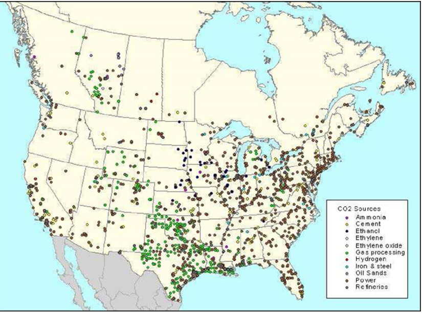
Overall, the atmospheric rise of CO2 is proceeding faster than a linear increase. This is a reflection that increasingly more human activities involve the use of fossil fuels and the subsequent direct release of CO2 into the atmosphere. Indeed, there are well over 8000 individual points of CO2 emission in the world, many of them located in North America.
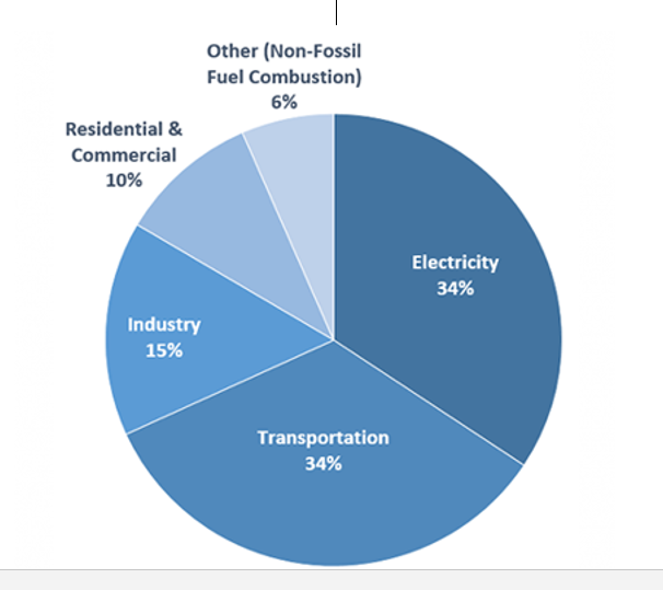
The situation for the US in 2016 is shown below where it can be seen that the electricity and transportation sectors contribute equal amounts of annual CO2 emissions. On a positive note, better management of forests and grasslands since about 1990 have enhanced their sink capacity. In 2016 this enhanced sink was measured to be equivalent to 12% of total emissions in 2016.
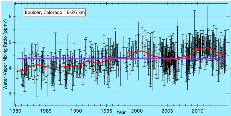
Since warming is occurring there is a reasonable expectation that atmospheric water vapor should increase. However, this is difficult to confirm. Measurements of atmospheric water vapor from satellites are difficult to properly calibrate and atmospheric water vapor is not uniformly distributed across the planet. The amount of atmospheric water vapor can be strongly modulated by SST oscillations and events like El Nino. The longest running well-calibrated observation has been going on over Boulder, Colorado, USA since 1981. The data through 2016 are shown below and the purple line represents the average of the entire dataset and the red line is a running 5-year average through the data.
Inspection of this graph yields the following statements:
- The data themselves show strong fluctuations.
- From 1980 -- 2000 there is an average rise of about 20% which is fairly consistent with the expectations raised early
- Since 2000 there doesn't appear to be a significant increase but instead multi-decadal behaviour is forcing strong modulation.
Overall while the data is consistent with the postulated existence of the water vapor feedback loop, the noisy and modulated form of the data does not lend itself to very certain predictions about the amount of future water vapor.
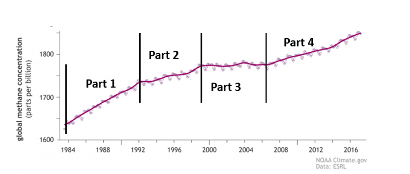
For global atmospheric methane the data, shown below, are somewhat difficult to understand and consists of four different parts as indicated. The variations around the mean trend line are seasonal.
Part 1: 1983 -- 1992: This shows a linear rise at the rate of ~12 ppb per year for an overall increase in methane of 6%. If this rate had continued, current methane levels would be about 2040 ppb compared to the observed value of 1858 ppb.
Part 2: 1992--1998: Here the rise is still linear but at the reduced rate of ~ 4 ppb ; a factor of 3 decrease from the previous time period.
Part 3: 1998--2007: Here the emissions profile is flat. Methane concentration in the atmosphere remains constant. There is considerable scientific uncertainty over this result. Many explanations have been suggested but the two most plausible are a) global wetlands were in a general state of drought during this period thus reducing microbial activity and b) the collapse of the USSR meant a large collapse in coal and oil mining operations which were notoriously leaky.
Part 4: 2007 --Current: Methane emissions are on the rise again at an average rate of 7.2 ppb but this can be divided into two phases. From 2007 --2013 the rate was 5.5 ppb but from 2014--2017 it had risen to 9.5 ppb, close the value for Part 1. A formal Z-test shows that this difference in slopes is significant. Thus, this recent uptick in methane emissions activity should be taken seriously as an increased threat for climate forcing.
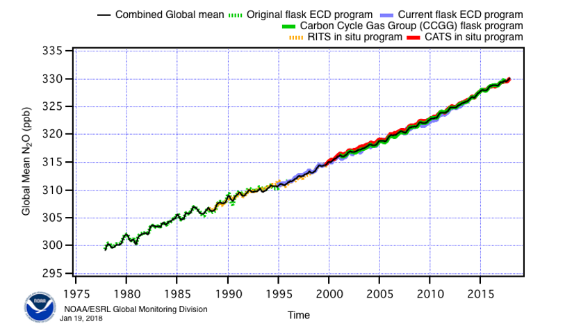
For Nitrous Oxide, in the year 2016, agricultural processes accounted for 77% of emissions. We therefore would expect increases in Nitrous Oxide with increasing worldwide agricultural activity. Globally about 40% of total N2O emissions are associated with human activities -- the other 60% come from the natural planetary nitrogen cycle. The emissions profile of N2O, as measured by several different experiments all of which are in good agreement with one another, is shown below. The data indicate a steady linear rise without any of the features seen in the methane emission profile. Since 1980, atmospheric concentration has risen by about 10%. For the case of CO2 these emissions have risen by about 25%.
|