This is a custom exponential curve fitter that is designed to fit an exponential growth rate to a time series of data via visual regression. Visual regression means best fit by your eye.
Why do this?
- Most all students seem to think that any "solution" returned by a machine is the "right answer". This leads to the broken notion that bad or noisy data still produces a "right answer". Bullshit. In the world of science, what this means is that there is a family of possible solutions all of which are consistent with the data. This is especially true when data is noisy or uncertain.
- With respect to the third assignment, I have attached some screen shots for the case of Clackamas county. Please note the
following:
- The X-axis is the time unit. In this case there are 7 values in the time series and each time series is one decade. So you just enter that in units of 1,2,3,4,5,6,7 as there are 7 time periods. The decades or years that correspond to those are irrelevant. Your determining the best fit growth rate (r) over these 7 time periods.
- The parameters to adjust are r (the growth rate) and a (the initial value).
- None of the data is actually a pure eponential so the curve will never go through all of the data points. You just manually construct a curve that looks reasonable. The example shown below is for r = .35 and a = 50:
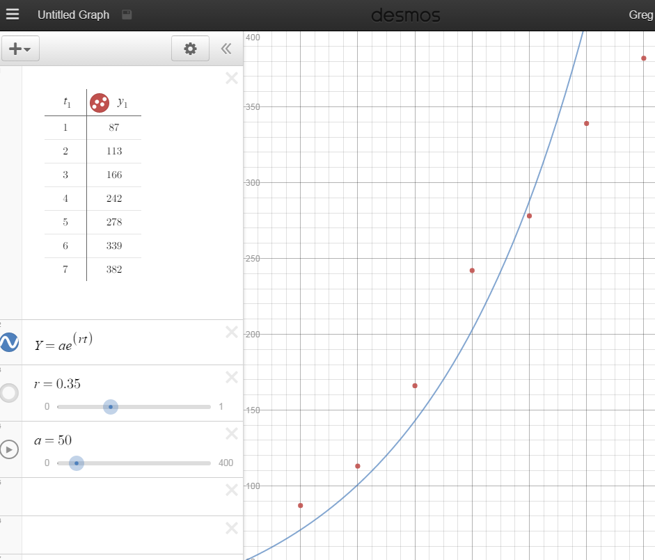
Note that the line does not go through all of the data points, and this particular fit shows that the last two time periods (last two decades) are below the growth rate.
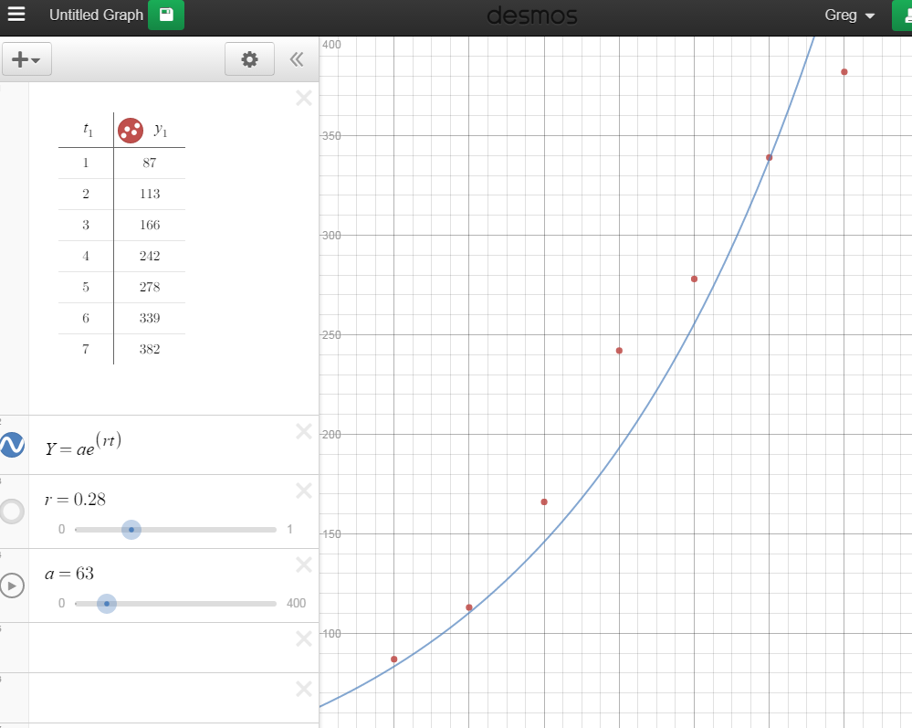
Another acceptable solution is shown below, in this case r = 0.28 and a = 63. This solution would highlight the fact that for 3 time periods in a row the growth rate was higher than the average. Remember, in this case its growth rate per time step (which is a decade here). The case of r = .28 means growth per decade at 28% per year. The expected doubling time would be then
70/28 = 2.5 decades (25 years).
The point remains that a range of solutions (growth rate plus starting value) is consistent with the data and doing this interactively and interatively by hand is the best way to show this.
- Link to the custom exponential curve fitter. (it defaults to the Clackamas county situation)
- Note: you will most likely have to adjust the X and Y graphing ranges. This is done by clicking on wrench in the upper left corner (as its well known this is what wrenches do ..) that will bring up this menu:
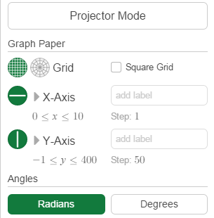
where you click on the numbers under X-axis and Y-axis and set the plotting range values.
|