The Activity Manager/Worksheet Launcher
- Text based mode
- Download the Activity
Manager. (disregard any entries already there).
This window should look about like this
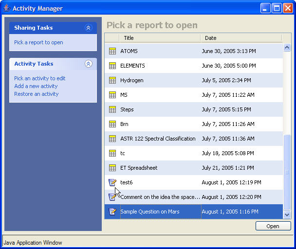
- Under Activity Tasks Select Add a new activity
- Double Click Essay Activity
- Highlight the Title field and put in a title that is in the form of a question
that you would like to ask; e.g. Discuss the relative pros and cons of a manned mission to Mars
- Set the session ID to some unique 3 digit number (e.g. 123)
- Save
- Now you should see your created item at the bottom of the activity manager with
the appropriate timestamp. Now select Pick a report to open and double click
on the question you just created. That window should look like this

The next step is to find some clients (i.e. other computers and users)
- Each client should Download the Worksheet Launcher (disregard the material already there). That window should look like
this
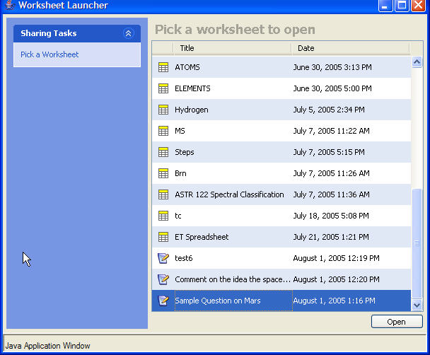
- Each client should scroll to the bottom of the worksheet until they find the question
that you just composed. Then double click on that question to open the work sheet.
- You may want to maximize the window that opened
- The title of that window should contain the question you asked and it should look
something like this

- Clients then type their response into the box below (there are some style/formatting
buttons that can be used). When they are done each client submits by clicking on
Publish to global view . This pops up a dialogue box in which some unique name
should be entered. The click on "OK".
- Observe what is happening in your report window (this window says Essay Report
in the top. As each report is submitted the counter increments and the name of the
contributor appears in the bottom pane. For example:
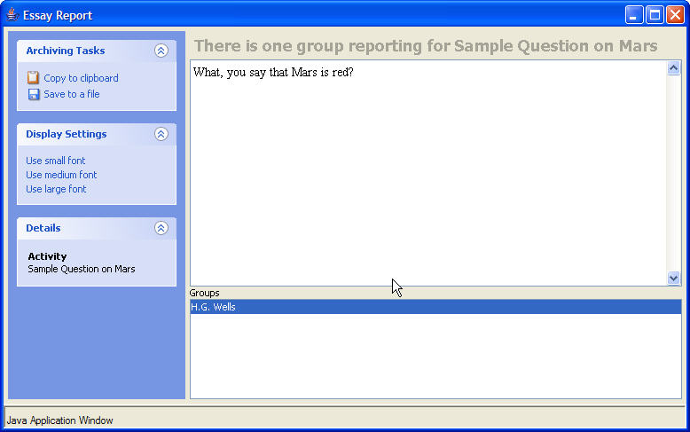
Clicking on that name brings up their text. When a second person responds, you can see the counter increment and their name added to the list.
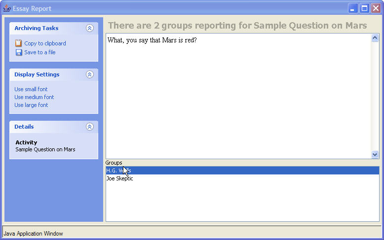
And Voila the responses pour in for you the instructor to evaluate and discuss. This is how the simple text mode works.
(before proceeding to prevent window overload, its a good idea to close all the windows except the ones labeled Activity Manger and Worksheet Launcher )
- In the Activity Manager click Pick a report to open and then select the activity dated July 21 and titled
ET Spreadsheet - you will see a bunch of previous work there. We can focus on that later.
The report should look like this

- From the Worksheet Launcher your clients should select the worksheet ET
Spreadsheet This opens the client worksheet

that contains the parameters for the Drake equation. The user types in numbers in each cell by clicking in the cell and entering a number. Possible values are:
- R* = 10
- F(p) = probability of planetary formation (a number between 0 and 1)
- N(e) = number of earth like planets per solar system
- F(l) = probability of primitive life (a number between 0 and 1)
- F(i) = probability of intelligent life (a number between 0 and 1)
- F(t) = probability of developing technology and EM communication (between 0 and 1)
- L = lifetime of technical civilization in years
After the individual cells are filled in, clicking in the last cell N(c) multiplies it all together. As before, select publish to global view to publish your results.
- In the reporting window (titled Dtable Report ) you will see each individual spreedsheet entry appearing. From that window you can sort any column just by clicking on the column heading. This way you can order and compare the range in parameters selected by the students which frames an extended discussion.
-
Open up the Global Viewer for this application. It should look like this:
-
Download the image worksheet
which looks like this:
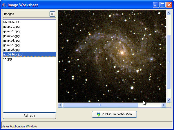
- The library of images is in the left pane, clicking on any one loads the image into
the viewer (you may want to maximize the viewer).
- Click on the top image, N6946A.JPG. The two white lines pointing to a star in
that image show the position of a supernova that occured last year. Now click on
the image near the bottom that says ngc6946b.jpg. This is a before image (taken at
the Pine Mountain Observatory through different filters). Draw a circle with your mouse
on that image where you think the supernova occurred. Publish this to global view.
- Now the global viewer, titled Image Report will contain the name of the client/person
who published. Highlighting that name will load their annotated image into the viewer. So
you get something like this
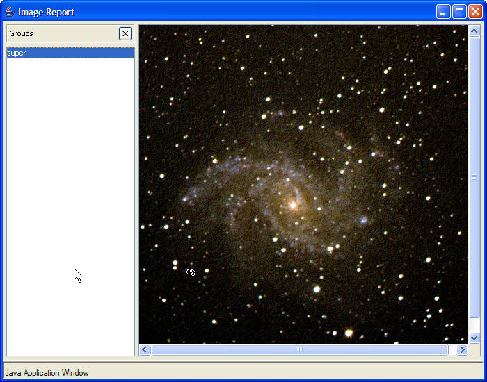
In this way, the instructor can cycle through lots of different images submitted by the clients. The applications to this basic image push-annotate-pull structure are many and varied. In addition, students could publish an image directly to the projector in this class in this way, as long as the instructor has the image view report open. In this way, you can involve the students in various resource finding adventures and the like and this helps with student engagement. I have done this on numerous occassions.
-
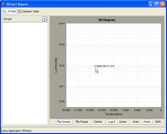
Download the XY report Global Viewer This should look like the following:
-
Download the client worksheet This should look like the following:
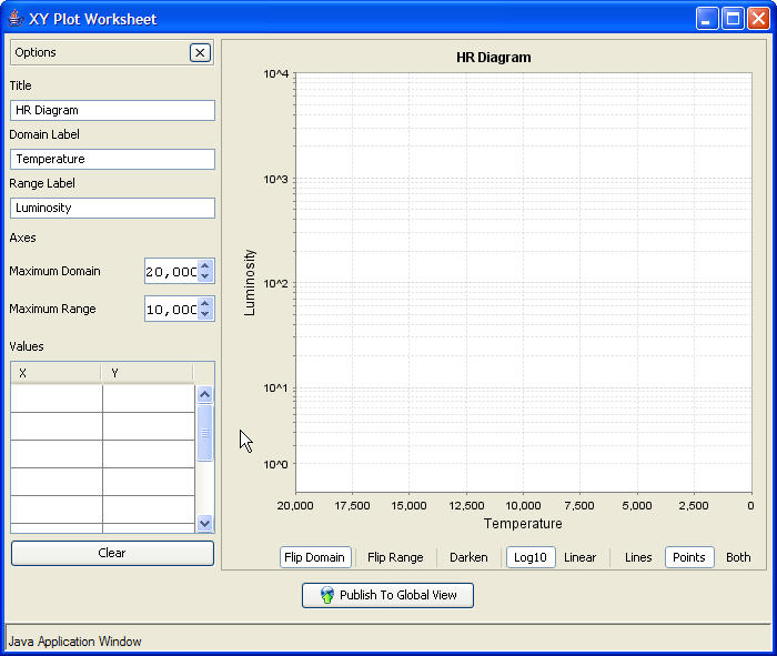
- The exercise is to plot the positions of the following kinds of stars
- A 2 solar mass main sequence star
- A 10 solar mass main sequence star
- A star at the tip of the red Giant
- A hot white dwarf
- the position of the sun
- As soon as the student finishes their lot and clicks Publish to Global View
Their plot appears in the Dchart Report window, as follows:
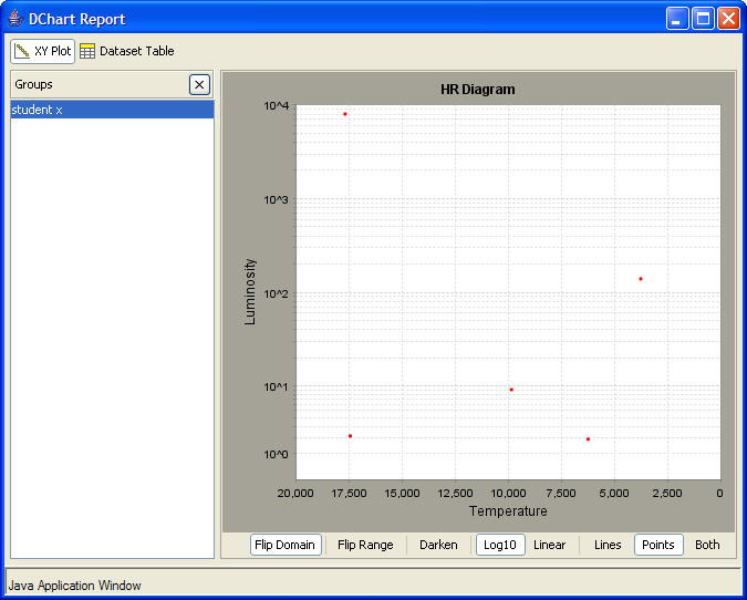
- If you click on the Dataset Table Icon in the chart report, you will see their
actual X,Y data values.
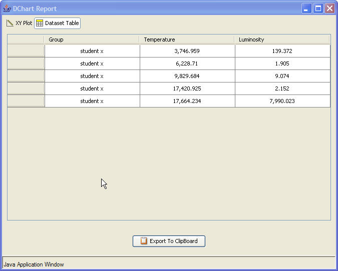
Again, this interface is powerful and generic and represents an efficient an organized way to collect and compare graphical data from various students or student groups. This again has wide applicability across many disciplines. The XY Chart authoring tool will soon be integrated into the Activity Manager. Again, I remind the reader that this is all happening real time in the classroom and if your running through these demonstration pages with a few laptops, then you will get a feel for this on your end.
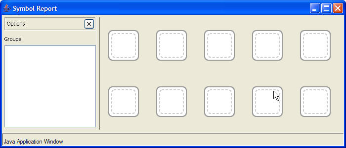
- Download the
Story Board Global Viewer It should look like this
- Download the Story Board
Worksheet Note that this worksheet is not a Web Start application but instead is
done in Flash . Nonetheless, we can still incorporate publish to global view
within the Flash environment. The worksheet should look lik this:
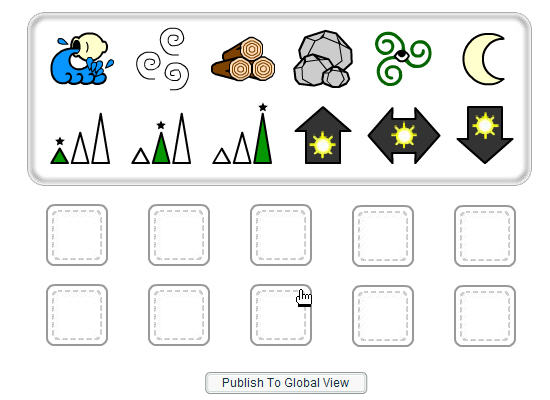
- The exercise here is for the student to learn about language standards. Your "language"
consists of the indicated 12 symbols. Students are then shown an image of a large water
fall and asked to use the symbols to represent it. You then drag and drop them into
the blank boxes and so you might get something like this:
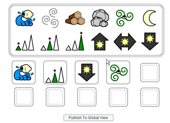
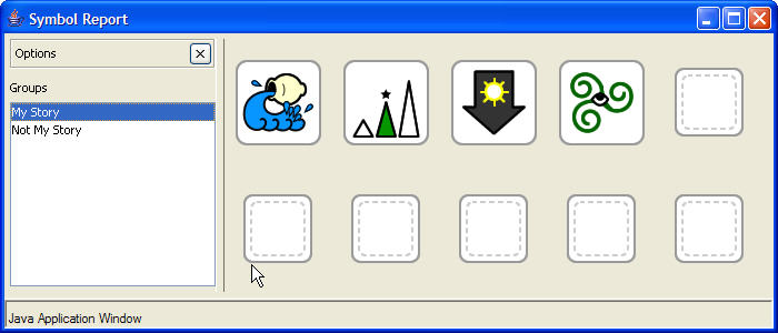
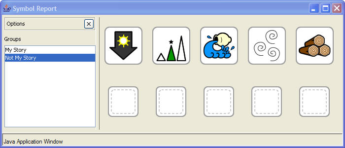
- Now Publish to global view. Various student responses are then instantly published
and the instructor can cycle through and compare responses. For instance:
Again, there are lots of applications for this kind of procedure. For instance, for astronomy one could show icons or images of stars in various stages of stellar evolution and ask students to construct the timeline by dragging and dropping the relevant icon into the right time sequence.
- Download the Hubble Law
Global viewer Note that this is an older one an so looks slightly different than
the previous cases. We will be intergrating this viewer into our newer, integrated look.
Your global view should look like this:
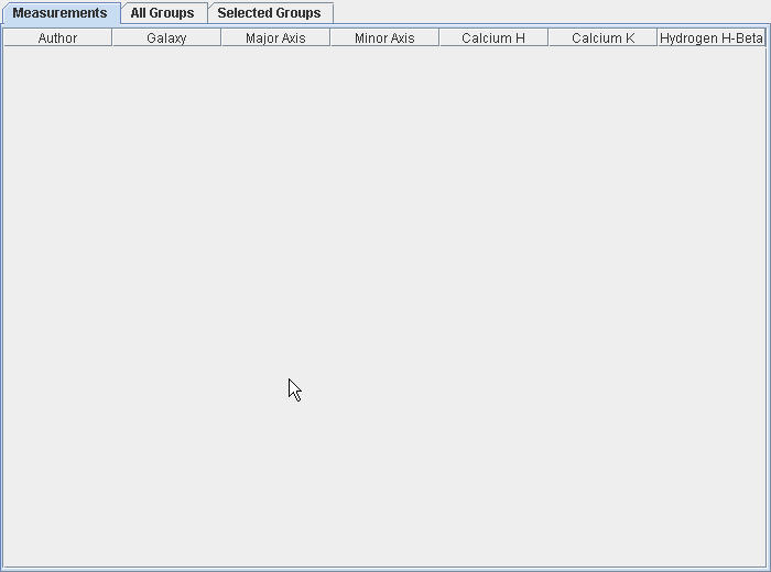
- Download the Simulator
which should look like this:
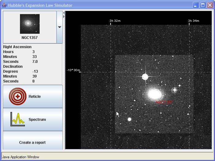
Notice also the floating measurements window which looks like this:
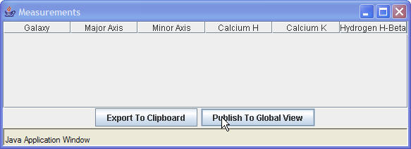
Now there are lots of measurements that students do within this simulator window:
- Select a galaxy from the drop down list of iconic images. In this case I have
selected NGC 3941:
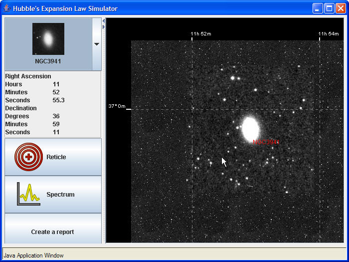
- Click on reticle to bring up this view:

- Select Pan to move the image so its reasonable centered on the red reticle
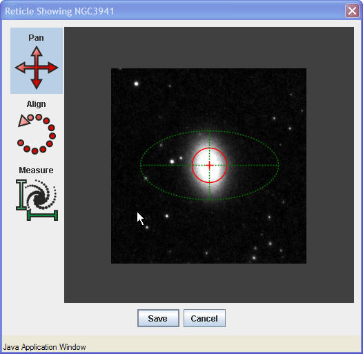
- Select Align and the rotate the image so the majox axis is East West (e.g.
horizontal on the screen:
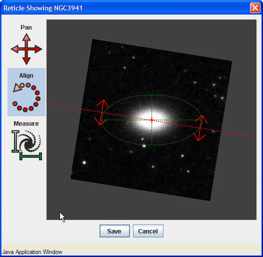
- Select Measure and move the green handles so the ellipse roughly outlines the
outer edge of the galaxy. The yellow bars indicate the major and minor axes sizes in units
of arcseconds (yes this galaxy is small).
- Select Save
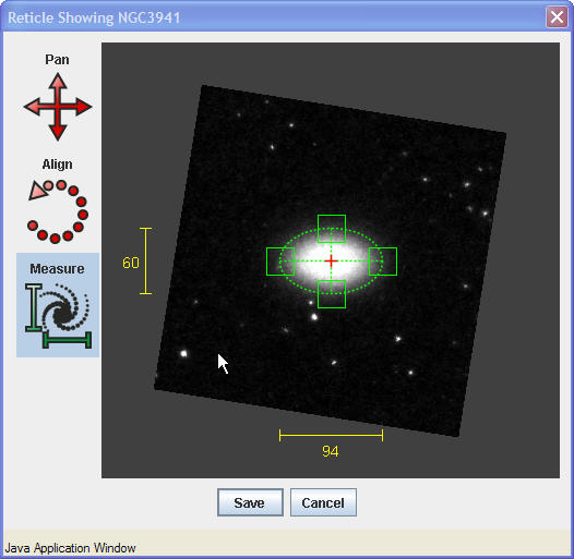
And the measurement have been published to the measurments floating window:
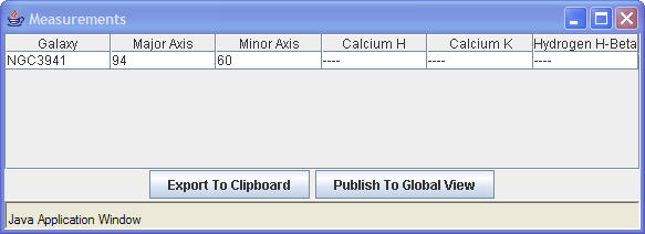
- Click on Spectrum and up pops the real spectrum of NGC 3941 (from
R. Kennicutt).
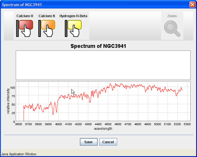
- Flag the Calcium H,K and H-beta lines (if there) by clicking on the flag and dragging
to the right wavelength. Shown here are H and K
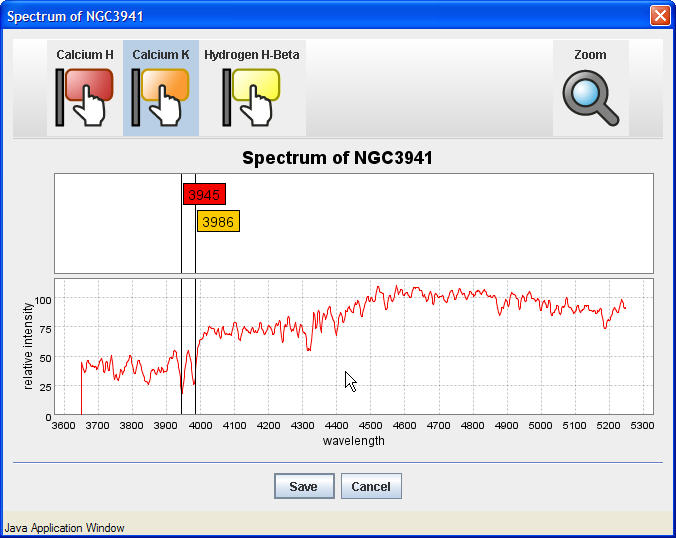
- Select Save to add to the measurements table
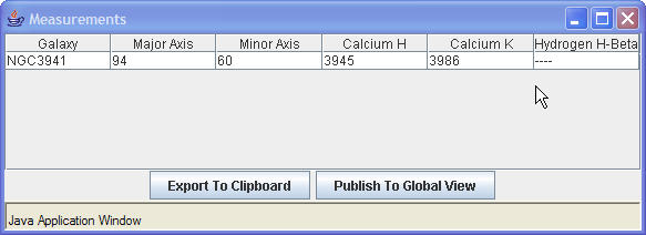
- Now select Publish to Global View and publish as Group 1 (your name can
be anything here). After a few groups have published their measurements/data, the Global
Viewer begins to fill out and the instructor can start to compare difference in measurements
for the same galaxy.
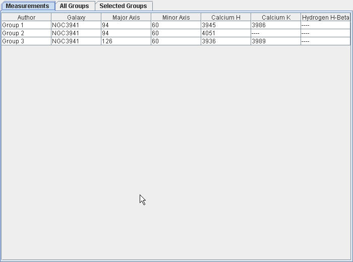
Again, this example captures the basic idea in that the whole intent is to have a central place for students to "publish" their work. In this specific example, if different groups are assigned to each work on 4-6 galaxies, the entire Hubble galaxy original data set can be measured in about 30 minutes by a class.
- Download the Global
Dtable Report for this application It will be filled out later.
- Download the Flash Simulation
- Select Officer Mac and your screen should look like this:
Officer Mac
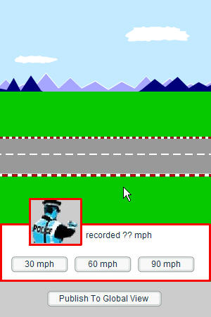
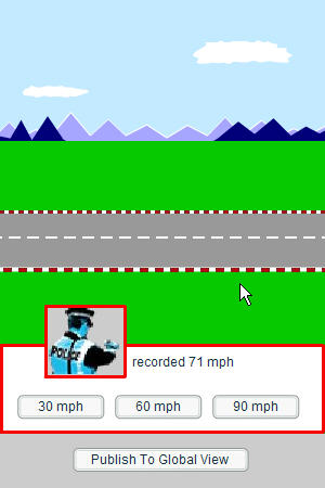
- Run the test at 60 mph by clicking on 60 mph . The velocity of the cow that
appears is always 60 but that velocity is read by a radar gun which has some random and
some systematic error. In this case, officer Mac has registered a speed of 71 Mph for
this trial. Publish to global view to see the entry appear in your Dtable you opened
previously.
Officer Mac
- Now imagine there are 23 students with laptops, each doing one trial for officer Mac
and publishing their data. In that case your global report would look like this.
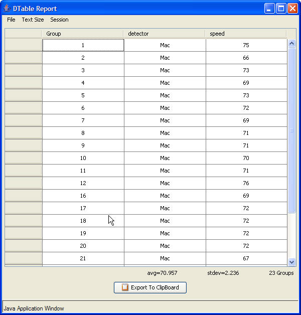
And for this example one sees that officer Mac has a systematic error of about 11 mph (difference between the observed average and the true average of the reliable cow) and a random error of 2 mph (measured through the standard deviation). Through this process, the students can rapidly assess the relative amounts of systematic and random error per officer and in the end determine who is the good cop and the bad cop. When asked a question about systematic and random errors on the midterm exam, most students come back to this example they did in class in answering the question. This exercise is also part of a standard homework assignment
Understanding this crucial aspect of measurements is one of the foundations of science literacy. We have discovered that by putting this in a real life context, students are more easily able to grasp and understand these concepts.
In this simulation, different police officers are used and each police officer has a different amount of random and systematic error. Students all take data on one officer at a time and publish that data. The averages and standard deviations of their submitted data are done on the fly and from that, random and systematic errors per officer can be determined. This works!
Lots More to Come
- Select a galaxy from the drop down list of iconic images. In this case I have
selected NGC 3941:
SpreadSheet Mode
Image Annotation Mode
In this mode, an image can be pushed out the clients, who can then annotate or identify features on that image and then publish their annotated image back to Global View. At the moment, the annotation set is limited only to drawing free form with your cursor on the image, but soon will include arrows and text boxes.
Walkthru:
XY Chart Mode
-
In this mode, students will be supplied a graph with existing axes and domains. Within
that graph they would plot points by either entering their values into a table or by
clicking inside the graph. There are many different exercises that one could construct using
this interface. The example below actually comes from a final exam done on student
laptops.
- In this mode, students can drop and drag icons into a sequence story board and then
publish that sequence to the Global View.
This mode is basic to coupling individual work in simulations and measuring engines with the actual publishing of the data and results. We will give several examples of use that show this mode in action. A lot of this mode involves groups of students working together and then publishing under a group name.
-
Hubble Law Simulation
In this simulation, students are provided images and real spectra of all the galaxies used by Hubble originally to discover the expansion of the Universe. Students will measure angular diameters of the galaxies and the observed wavelengts of 3 spectral lines which they will later use to extract the redshift. They then plot (although not yet in this application) angular diameters versus redshift to produce their final result.