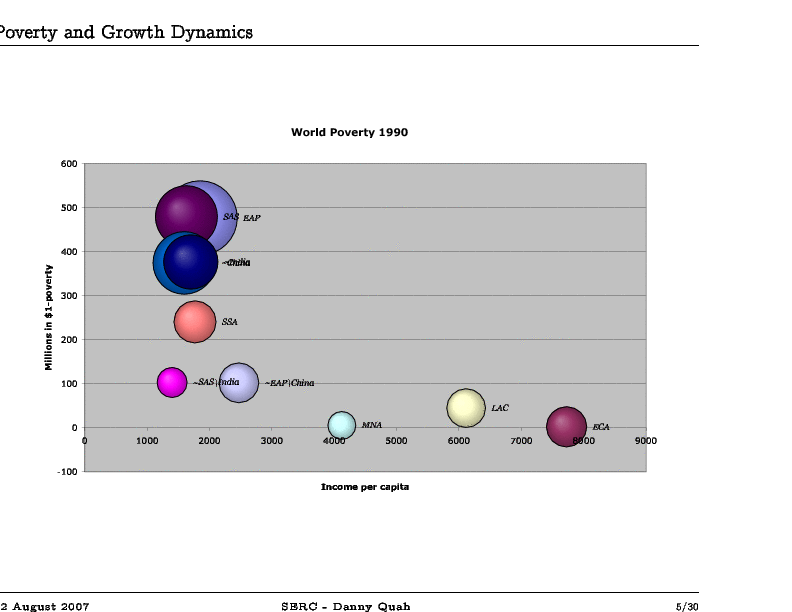
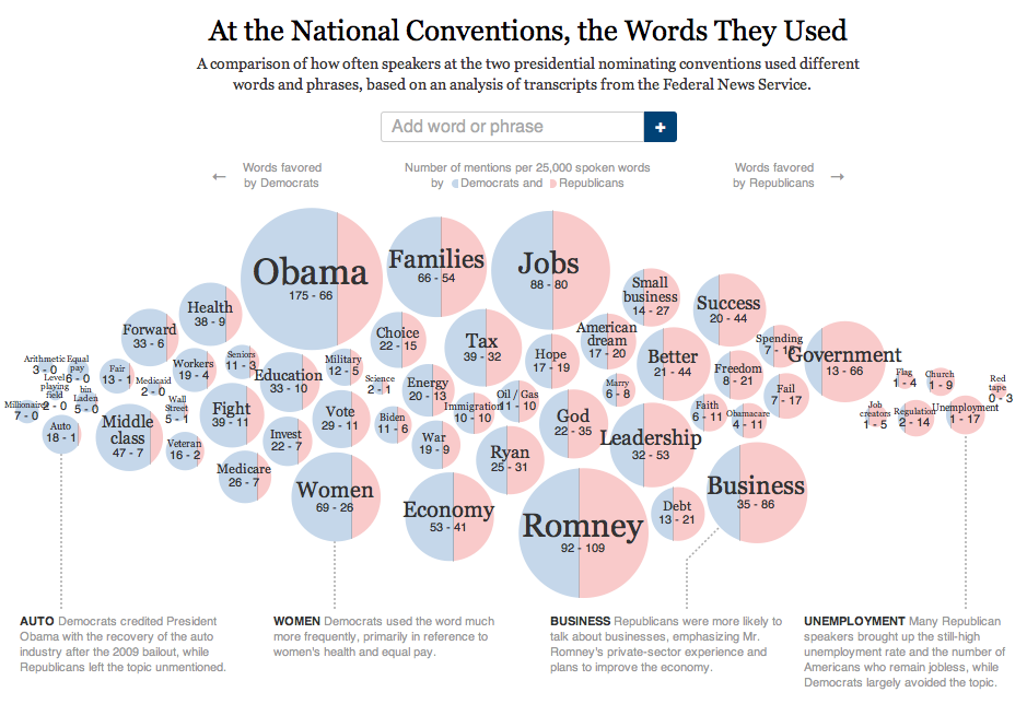
A now common way to represent attitudes or activities in terms of frequencies is through a bubble chart.
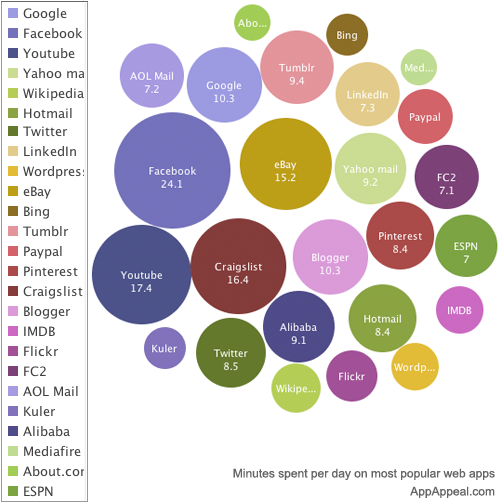
Sometimes Bubble Charts can visually represent common data
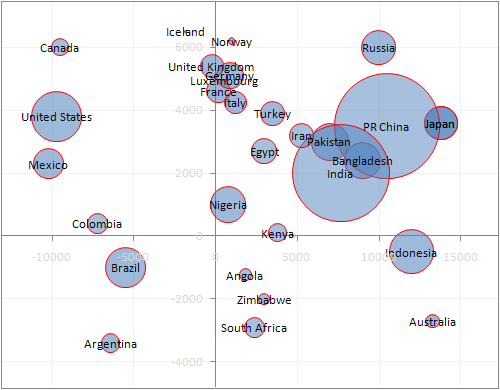
in interesting new ways. Quadrants are East or West of Greenwich
and North or South of the Equator; radius of the circle is population;
center of circle is geographic coordinates of the center of the country.
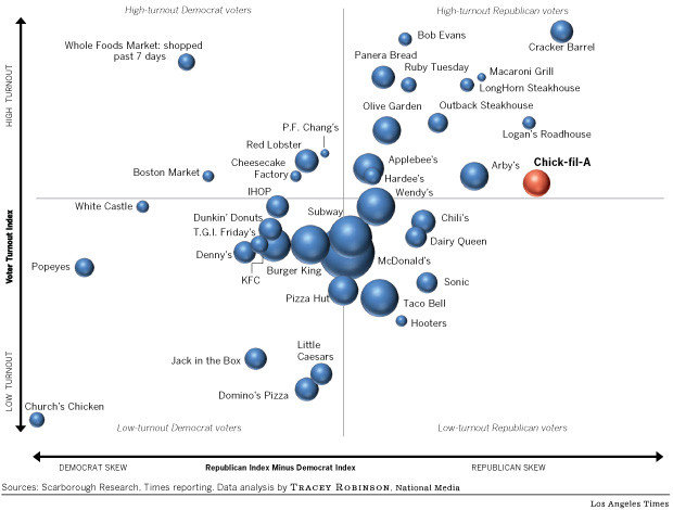
Here we represent political attitude and choice of where
to eat:
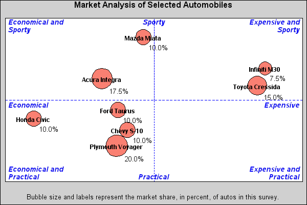
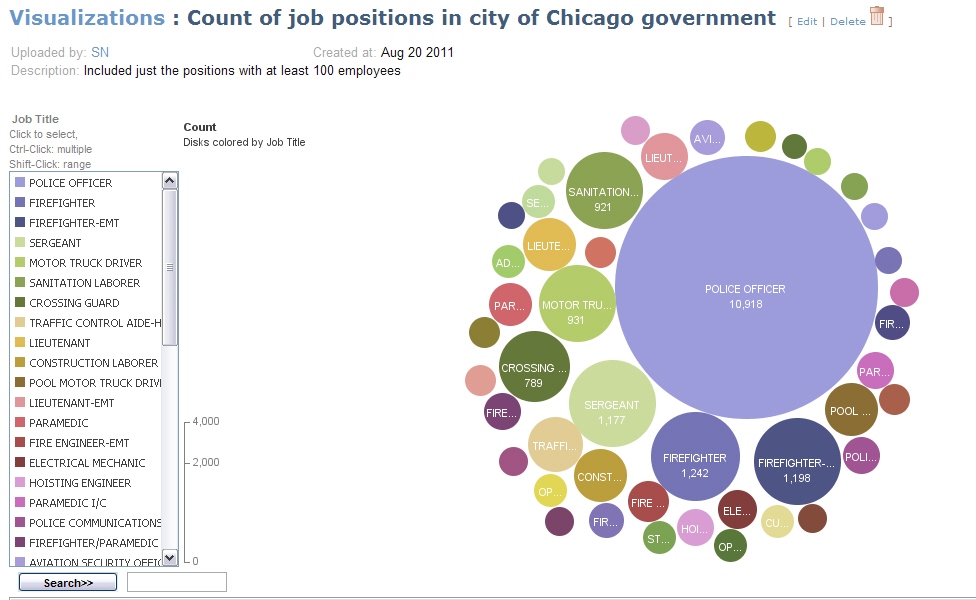
Combining qualitative and quantitative attributes:
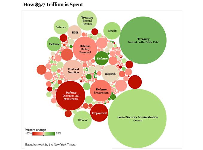
This format is useful also for representing time evolution of some phenomena:
This approach can be very dynamic:
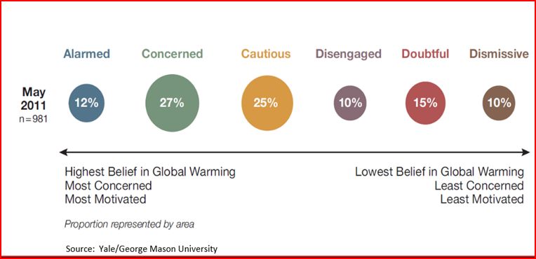
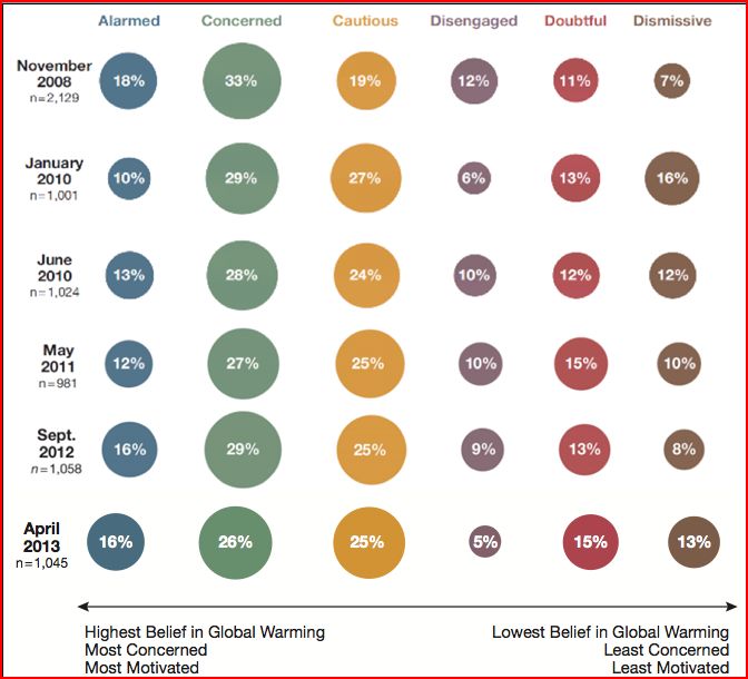
Attitudes about climate change and their possible evolution:
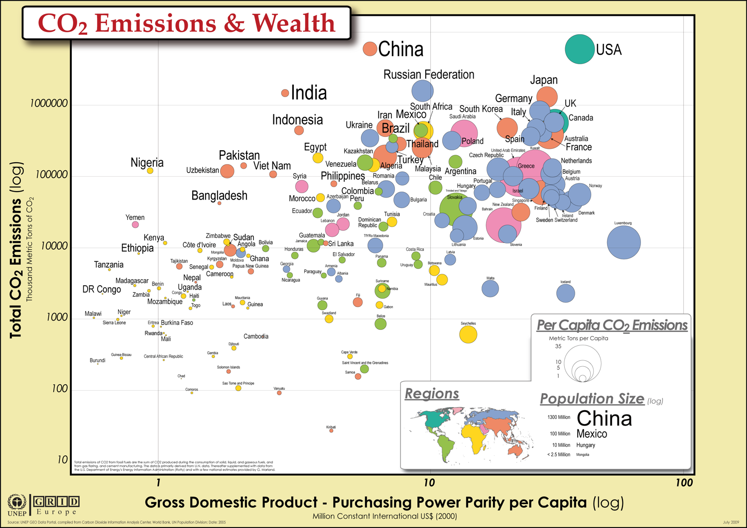
Another GHG emission representation:
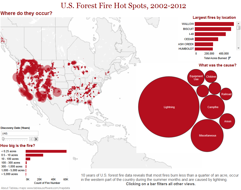
More examples:
Make your own Bubble Charts
Google Bubble Charts
Bubble Motion Charts
|