In general, the American Public is quite poor at risk assessment. As a result there has been a significant movement to try to better communicate risk assessment through various visual means. Some examples will be shown here.
But why are we so poor at risk assessment. Many studies have been done on this issue and here is a brief summary of the main problems.
- Risk assessment ultimately involves understanding chances of something happening and that involves probability and quantitative reasoning and understanding units. Thus, numerical illiteracy is really the main problem.
Example 1: In a series of experiments participants were told that weather forecasts called for a 30% chance of rain in both Seattle and Phoenix. When participants were later asked how likely they were to bring an umbrella on a trip to either city, they revealed that they believed it was more likely to rain in Seattle. Even though the weather forecasts took Seattle's higher "base rate" of rain into account, people tended to count the rate again in deciding that a 30% chance of rain in Seattle was more likely to result in rain than a 30% chance of rain in Phoenix.
Example 2: Studies show when people are asked to define an "unlikely" or "improbable" outcome there is a consensus around outcomes that occur 10%-30% of the time. Scientifically, improbable outcomes occur less than 1% of the time
For example, when participants read that a certain climate scientist thinks oceans are likely to rise 50-90 cm, they tended to call a 40 cm rise "probable" but a 100 cm rise "improbable."
Visualization techniques for risk management.
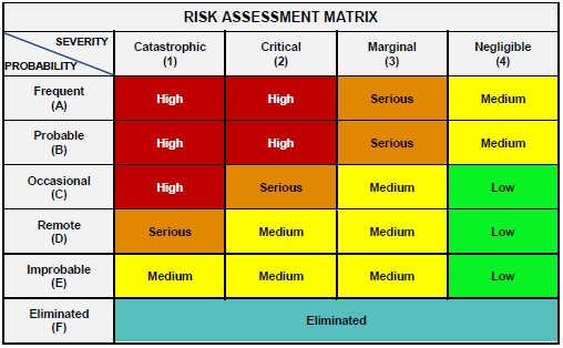
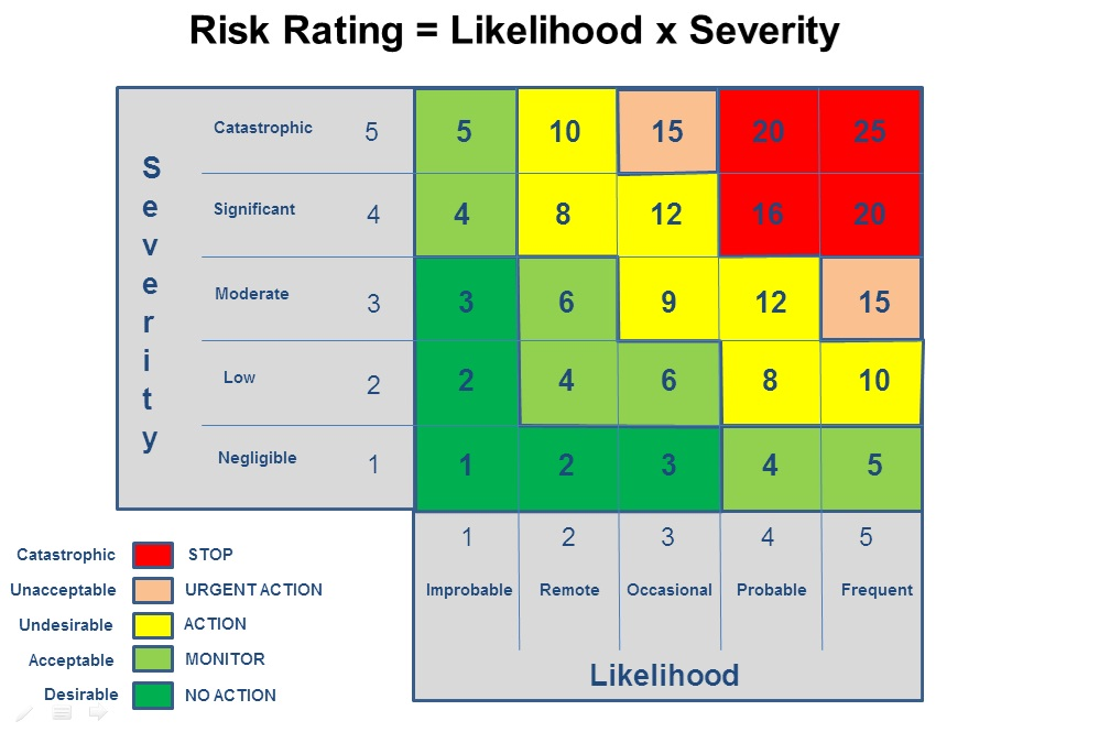
The Risk Matrix is frequently used - this is plot of basic likelihood of occurence vs severity. That is then distilled down into qualitative descriptions.
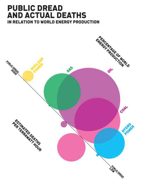
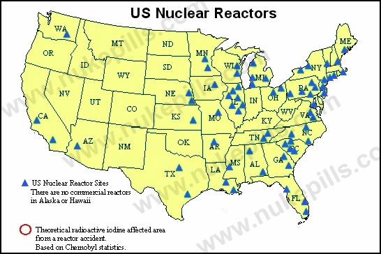
- Comparative Risk Visualization (a mircomort means one in a million chance of death).
- Weird?
-
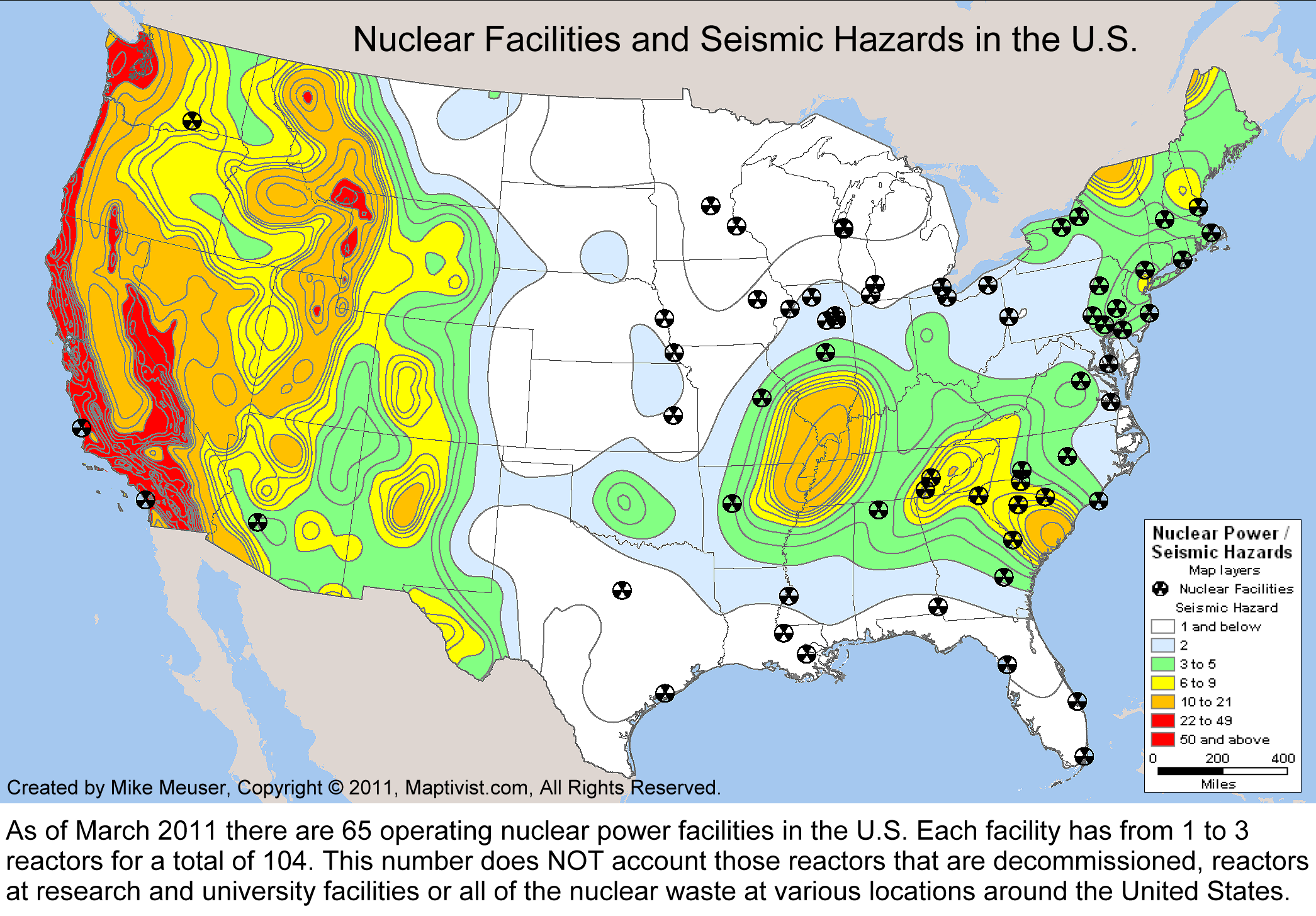
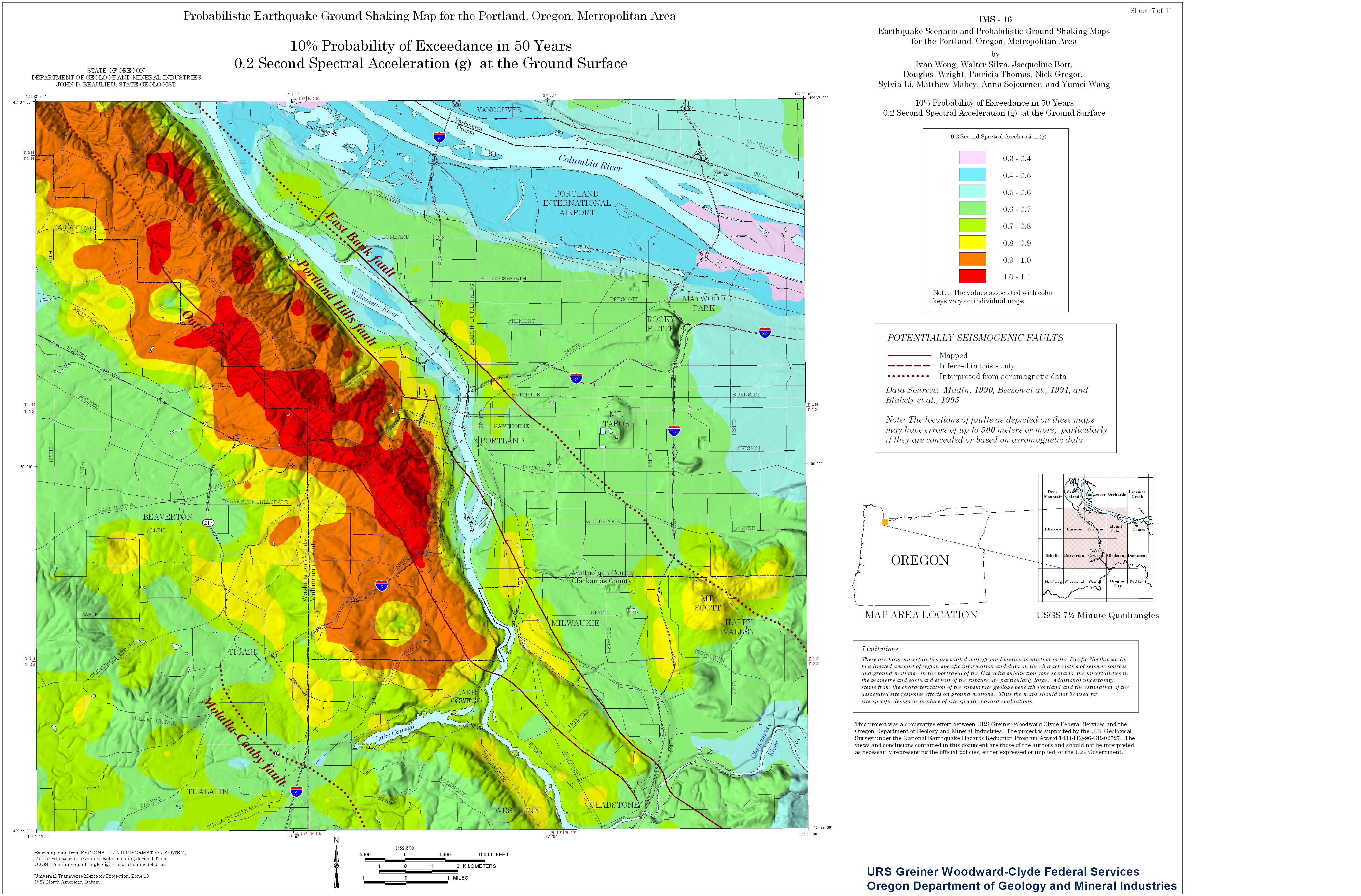
Example techniques for Volcano Risks
|