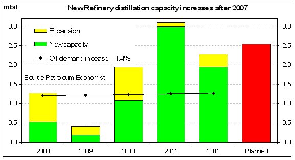
Over the last 2-3 years the world has been able
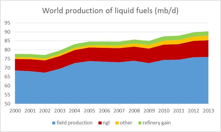
to squeeze out about 2-3 MBD more of out the Earth by building a few
more refiniries, converting natural gas to liquids (a very intensive GHG emission process, and find "other" sources). All of this effort
for essentially a 5% increase in the global oil supply.
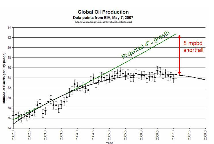
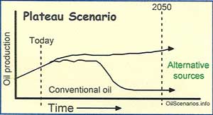
The waveform of the data from Jan 2002 through Sept 2013 has important features. The overall flattening of the data relative to the expected linear trend (orange dots) has given rise to the term "Plateau Oil" that effectively should replace "Peak Oil". In an ironic way, this plateau extends our fossil fuel dependence lifetime thus given us more time to implement solutions so Plateau Oil is much better than Peak Oil in this regard. Important features in this wave form are color coded:
|

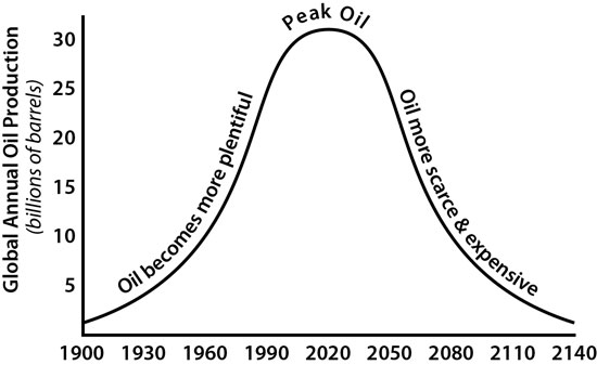
Simplified Peak Oil Picture is a Myth
 all that effort and expense
for a measly 5% increase in production. We truly are clueless.
