Let's start with the basics
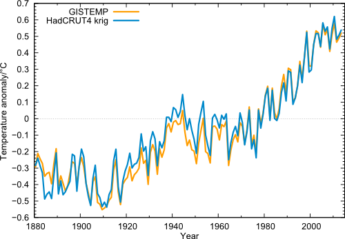
Does this figure mean anything?
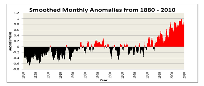
What about this figure?
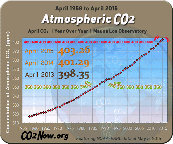
We know that atmospheric CO2 is increasing with time
and indeed the rate is also increasing:
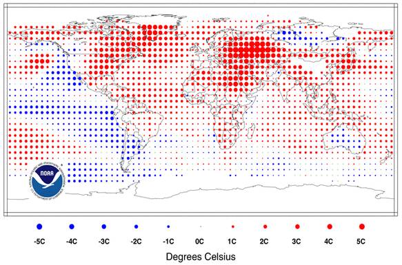
Best information is contained in gridded data.
By Far The best representation of temperature rises
Even the most ardent and conservative of fools can not argue against the claim that atmospheric CO2 is rising, and in fact rising at a much steeper rate than nature provides between Ice Ages. The argument that CO2 has gone up in the past is specious (i.e. bullshit) because those rises are done over periods of 10,000 years and we humans are
doing the equivalent in just 200 years. But the general population has poor to non-existent quantitative literacy, this distinction is not seen as important. Part of being scientifically literate is understanding that RATES FUCKING MATTER!
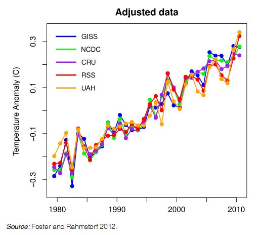
Within the scientific community there is considerable debate about how rising CO2 levels actually map into increases in global surface temperature. This is called climate
sensitivity. There was also uncertainty in how various groups
were actually measuring global average temperature. The figure below is important because it shows the 5 major players in these measurements and now all in agreement, after various calibration
issues have been sorted out. Thus its really true that the average planetary temperature is rising as the atmospheric CO2 rises so, most likely, there is a direct connection.
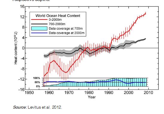
However, global surface temperature, as discussed earlier, is likely a lousy indicator. The figure below is far more direct
and physically relevant (and scary). The main physics of industrial waste heat and transport (we are warming the atmosphere through this same process) is to dump net heat flux
directly into the surface of the ocean, thus increasing its
heat content.
It is the heat content of the oceans and the movement of that
heat content which is the principal driver of the earth's climate
system. Screw with that and then screw with the climate. Very
recently it has been possible to calibrate local sea surface
temperature as measured by buoy sensors to map that into increasing heat content which is shown below.
One can see that since 1990, the oceans are absorbing more heat
than they can mix out. This heating can also be seen in a layer
at 700 - 2000m depth (although the effect is less). We are heating the ocean at a depth of 2km below the surface. That is almost physically impossible. We should get a titanium star
from the planetary engineering society for this achievement.
Moreover, once we have "overheated" the oceans we have past the point of new return - even if we turn off all industrial waste
heat channels today, we will still experience decades of heating
from this stored heat content in the ocean. This is known as
"warming in the pipeline" if you want to google on this information to for further verification. THIS IS THE CLIMATE PROBLEM! And, of course, this excess heat also drives
the thermal expansion of the oceans that has produced the observed rise in sea level.

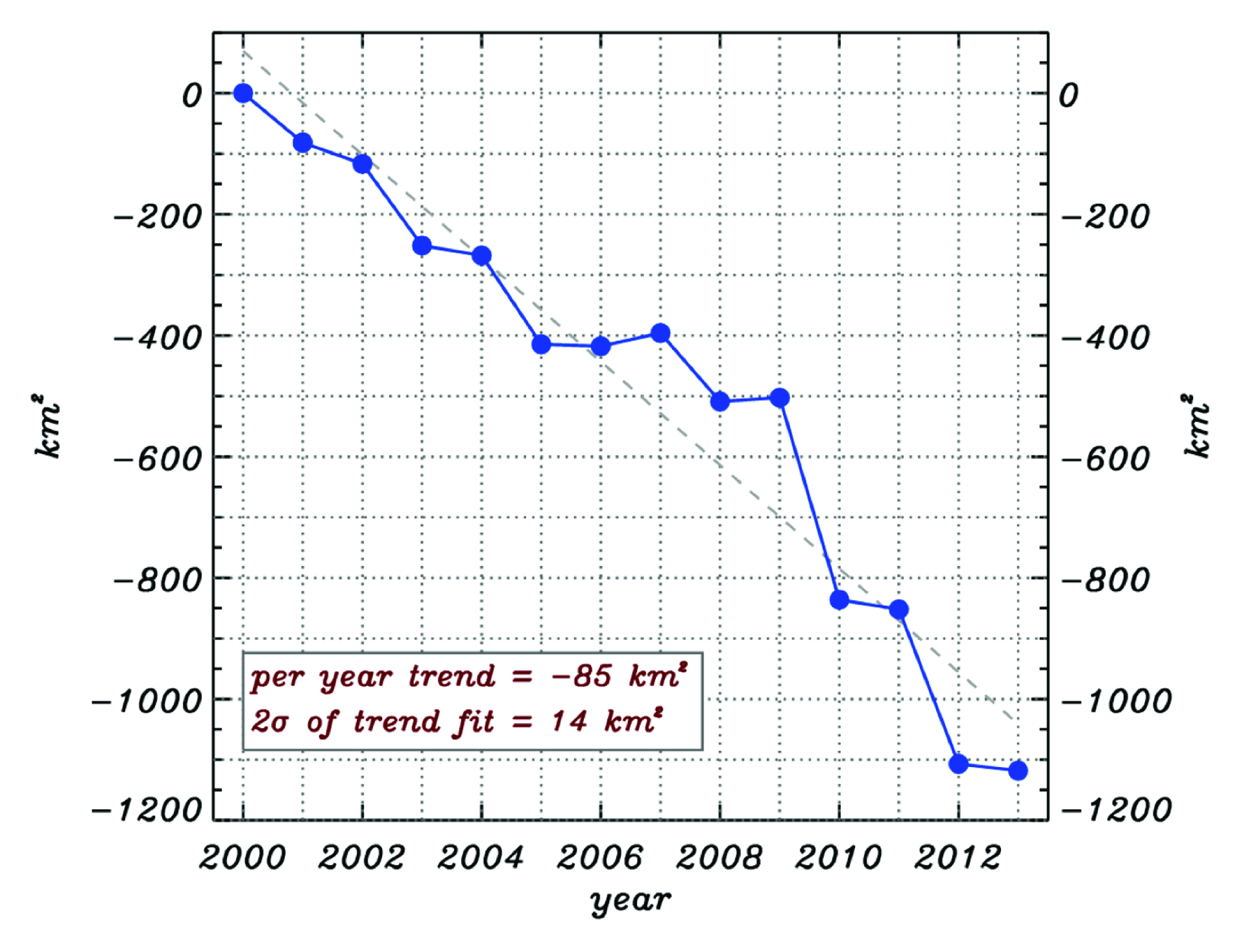
In addition to increasing ocean heat content, the other direct indicator of climate change involves the now rapid melting of Greenland and Arctic Sea Ice. Melting of these entities changes the overall reflectivity of the Earth and thus alters the planetary energy balance (which give us another titanium star).
The non-linear nature of the data (e.g. the effect is accelerating) is alarming.
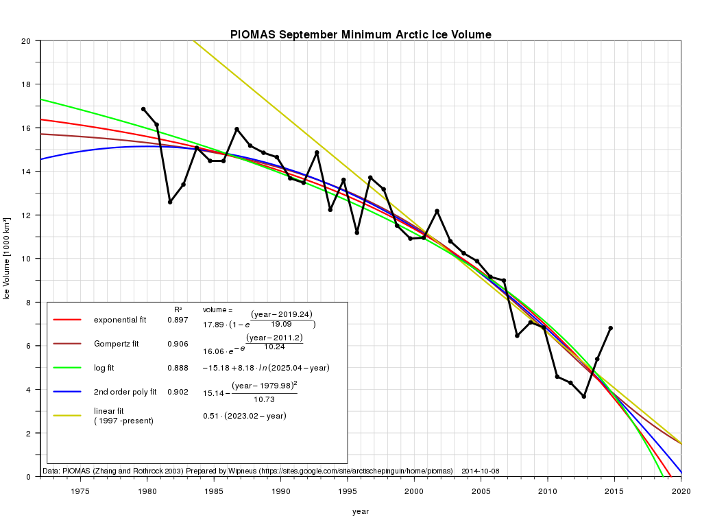
Greenland is going away
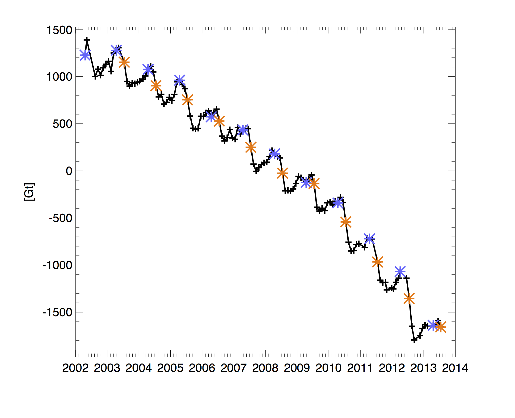
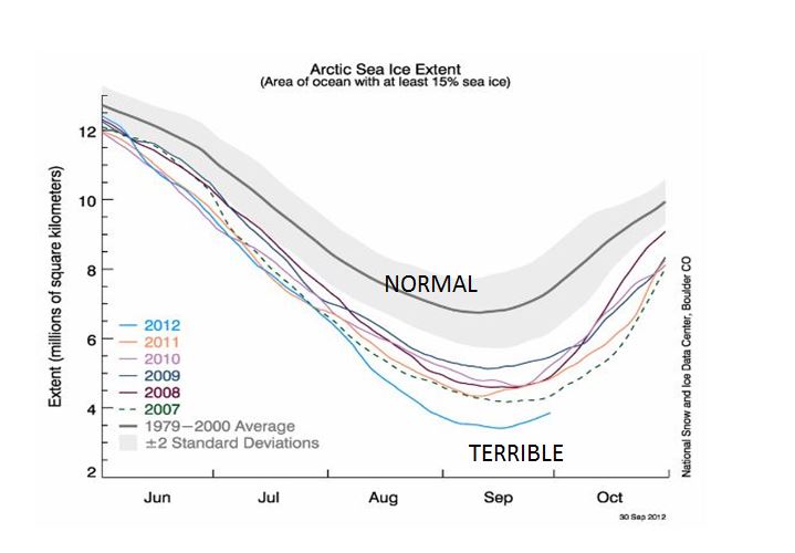
2012 Set a record for disappearance of Arctic Sea Ice
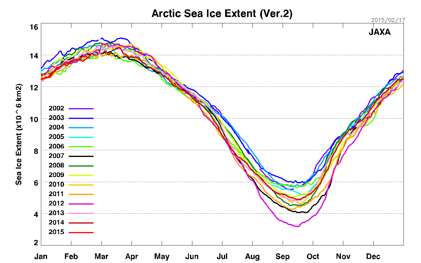
Updated to 2014
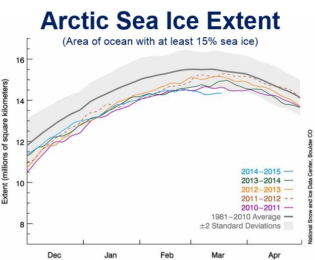
2015 looks really bad
Get Ready to Visit the North Pole in a Boat - Soon
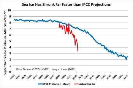
IPCC was very wrong on this one
This is CATASTROPHIC
Public Health Issues:
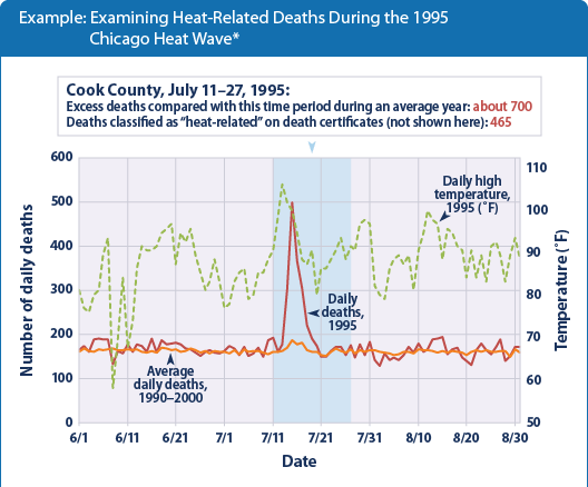
In terms of public health, deaths by heat wave are becoming more common. The image below illustrates one
case that occurred in July 1995 in Chicago. But there are many events like these in major Eastern Cities. And then there are
the larger scale events like Aug 2003 in France in which 11,000
people died and Russia in July 2010 where another 11,000 people died. These are real things - people are dying because of increasingly frequent extreme heat waves.
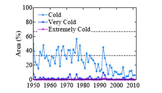
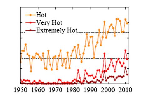
Recently, a new area analysis was done that identifies the time evolution of the percentage of land area in North America that is either cold or hot. The results are shown below were it can
clearly be seen that a) there is a strong decline in "cold" weather in terms of land area covered and b) all classes of
"hot" weather are increasing in terms of land area covered and
extreme summer time heat is approaching 10% coverage. The land coverage associated with "Hot" has at least doubled since 1985. Yeah, warming, its just a hoax ....
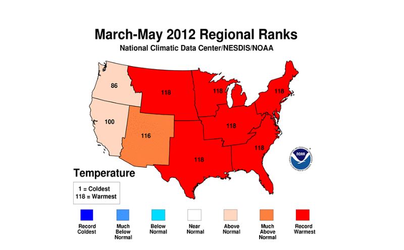
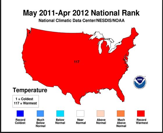
And finally there is this snippet where most of the US in the period of March-May 2012 set regional records for heat. This just doesn't happen in a regular climate that merely fluctuates.
This only happens if systematic trends exist.
 Climate denial can not hide from data. However, you live in a world that currently maximally devalues data and powers public policy
via opinion, fantasy and anecdote. We believe in superman, that we are special, that humans can't possibly alter the world, that
God (in whatever form) will protect us ... but good data doesn't lie and now it speaks volumes that change is happening now at very likely an accelerating pace. You have the choice to live in the Cartoon world (where its safe) or the real world. Choose wisely.
Climate denial can not hide from data. However, you live in a world that currently maximally devalues data and powers public policy
via opinion, fantasy and anecdote. We believe in superman, that we are special, that humans can't possibly alter the world, that
God (in whatever form) will protect us ... but good data doesn't lie and now it speaks volumes that change is happening now at very likely an accelerating pace. You have the choice to live in the Cartoon world (where its safe) or the real world. Choose wisely.
Speaking of Cartoons ...
|