Have the 20th century data been properly corrected for the effects or
urbanization. In many cases, the
location of the thermometer has not changed for 80 years, but in those 80
years, the cow pasture that the thermometer used to be located in is now a
parking lot or is now surrounded by buildings.
For example, the image below shows the environment an
official thermometer which is located in Lampass, Texas:

So there are significant issues of data
reliability over the period of record when it comes to using only the global mean temperature of the
Earth as an indicator of climate change.
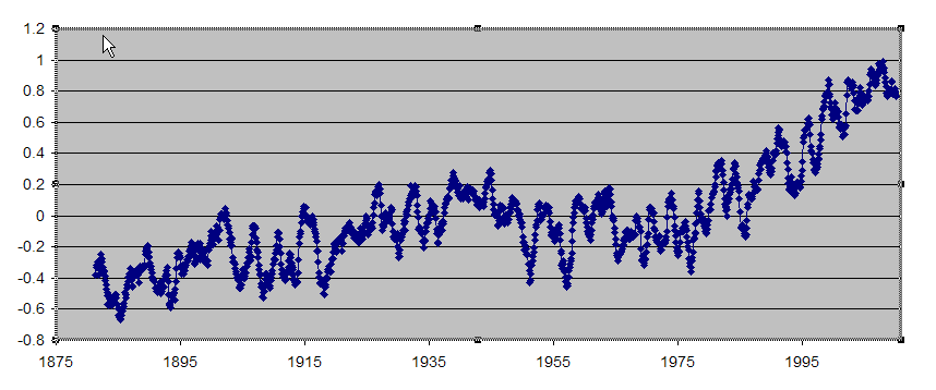
Now, concerning the top hockey stick figure -
what is typically plotted on the Y-axis is not the actual mean global
temperature but instead a deviation from the average value that is determined
by some baseline. While this form
of data presentation is scientifically valid, the amplitude of the deviations
does depend upon how the baseline is chosen.
In the diagram above, a baseline period of 1961-1990 was used.
(in most climate studies, 30 years is taken to be the time
period for establishing average behavior) as the baseline. Therefore, the mean global
temperature of the Earth over the period 1961-1990 is subtracted from each
yearly data point. The problem with
this approach is that is no guarantee that this period is representative
– furthermore, if this period was characterized by either general cooling
or general warming, then it doesn’t represent a flat baseline.
What you choose as your baseline
period does effect the data. In the
example below, we compare the 1961-1990 baseline subtracted data against that
using the period 1885-1915 for the baseline:
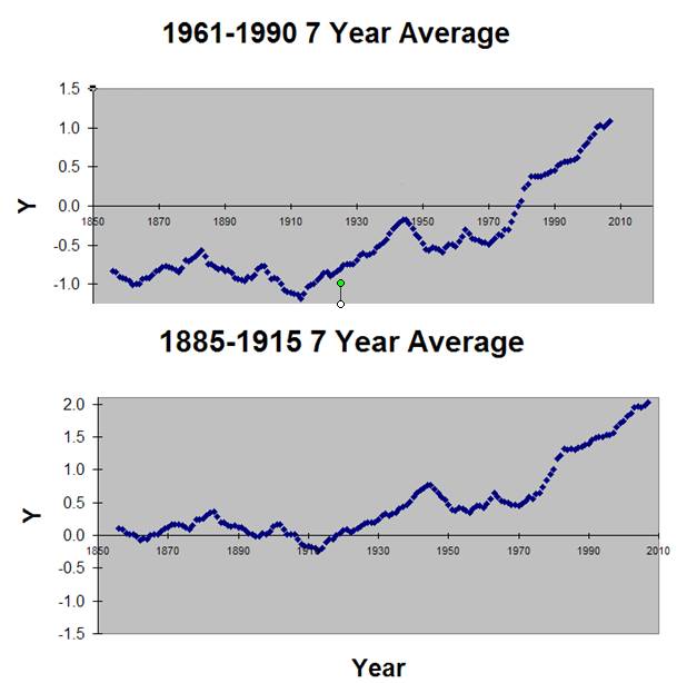
Clearly, by 2007, the amplitude of the warming
(value of the Y-axis) is larger in the case of the 1885-1915 baseline –
the overall shape of the curve doesn't change, of course, because
you're just shifting it up or down in Y by a constant, where that
constant is the average global temperature within the baseline period.
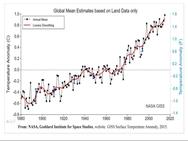
This is the set of generic arguments that can be made from just using global average temperature as the principle measure of climate change and those same arguments can certainly to all forms of the hockey stick. Here we show the 2015 version:
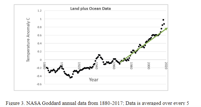
Recently, a slightly better version of global temperature data is now provided by NASA Goddard which now uses a combined land+ocean data set, and once an be sure that the ocean signal is not contaminated very much by urbanization. The use of this combined data set also, physically correclty, lowers the overall amplitude a bit of the temperature anamoly.

At this point, you should read this blog article about all
of this. The points in that blog are:
- The temperature data is not linear and therefore a non-linear fit is required.
- The last 4 years of temperature data should have the most weight as they clearly indicate that non-linearity is present:
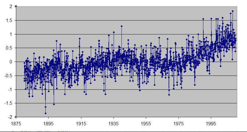
One of the problems with data representations like this is the
use of annual average temperature. Weather is not an annual
phenomena; it is primarily a seasonal feature.
The following represents a new approach to this by considering
monthly data rather than annual data (so now there are 12 data points per year). An example, done by
the author, is shown below.
Raw Data
The overall trend is more easily revealed when the
data is smoothed; in this case smoothed on a time scale
similar to the occurences between El Ninos.
Recent down turn most likely just part of the short term El Nino/La
Nino cycle. No evidence from this wave form that global warming
has stopped. This approach is more extensively discussed in
in this blog article . This article was done in response to the claims that global warming had stopped ...
A good representation of the hockey stick diagram, but one that
is rarely seen is shown below.
In this case, the +/- 2 standard
deviation errors are indicated (labeled as 5-95% decadal error bars), and the
data has been averaged over a long enough window to suppress much of the
inherent noise. The 4 colored lines
indicate the linear slopes that are obtained in different time periods, in
units of degrees C per decade. Presented in this way, the data reveal an increasing slope when the most
recent data is used. This is another way to indicate non-linarity.

Next we can make use of statistics to understand if the rise
is significant or not.
We can now also apply the Z-test to this global
data. For instance, we can ask the
question, is the average mean temperature of the Earth over the period 1980
– 2007 significantly different than the period of 1900-1980?
The actual global
data is here – but here is a table of the results:
| Time Period |
Avg. Temp |
Deviation |
Error in Mean |
| 1900 – 1980 |
58.2 |
0.37 |
.04 |
| 1980 - 2007 |
59.4 |
0.31 |
.06 |
| Z-statistic |
|
|
16.7 (!) |
So yes, a highly significant difference exists if
one wanted to present the data in this manner. But is that difference due to
urbanization and thermometer location or is it indicative of a real change in
the climate system?
The bottom line scientifically is that collapsing
all the data down to a one dimensional measure of global average temperature is
an ambiguous and unreliable measure of global warming.
A far more convincing case arises when the actual
location of the temperature measurements are used. Simple models easily show that heat
flows from the equator to the poles. Since there is much less surface area at the poles of a sphere, then the
heat flux per unit area in the Earth’s polar region will be higher than
in the equatorial regions.
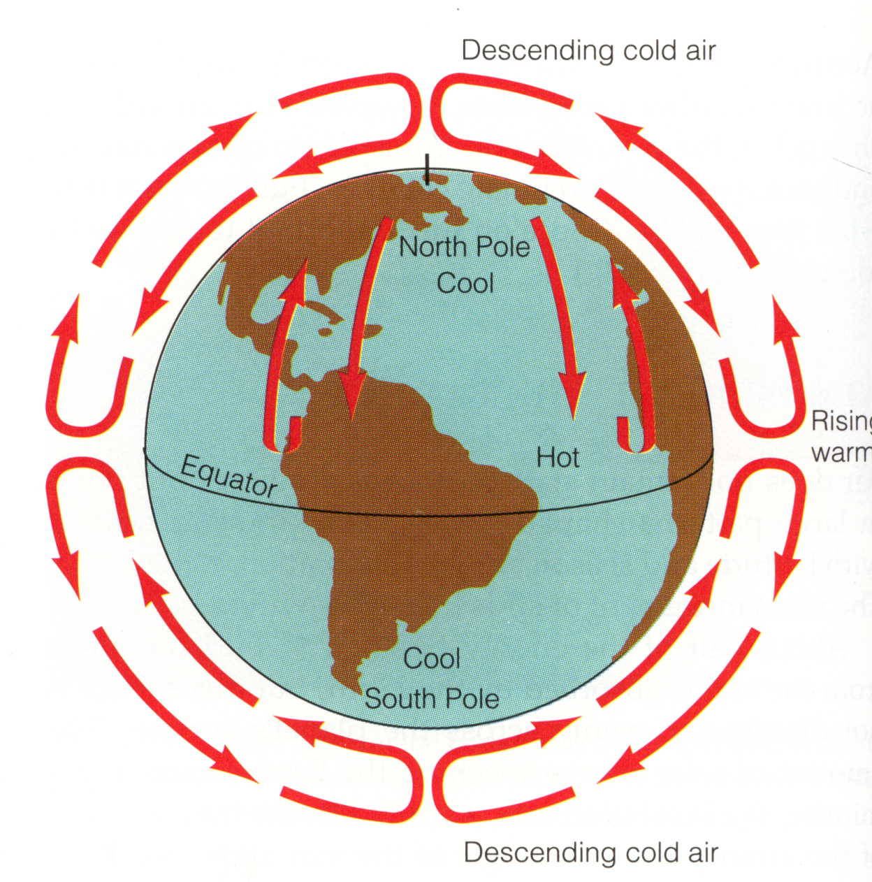
This leads to a simple prediction  Warming should be
higher in the high latitude regions of the Earth.
Here is some data that strongly supports this:
Warming should be
higher in the high latitude regions of the Earth.
Here is some data that strongly supports this:
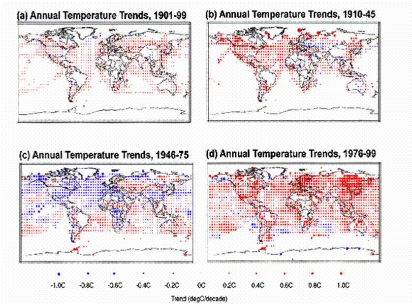
Here the temperature data is
sliced into 4 different time periods for analysis. Panel (c) clearly shows what is
known as the mid-century cooling period (seen in the hockey stick diagram over
the period 1940-1965). However, the
alarming trends appear in panel (d) – throughout the northern hemisphere,
there are significant temperature trends as high as increases of 1 degree C per
decade! It
is this form of data slicing and representation that is, by far, the most
scientifically convincing evidence that global warming is now seen in the
actual land temperature data.
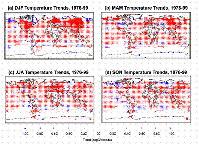
Further slicing of the data shows that this high latitude signal is
strongest in the winter months – this has grave implications with respect
to permafrost melting and methane releases which we will discuss later:
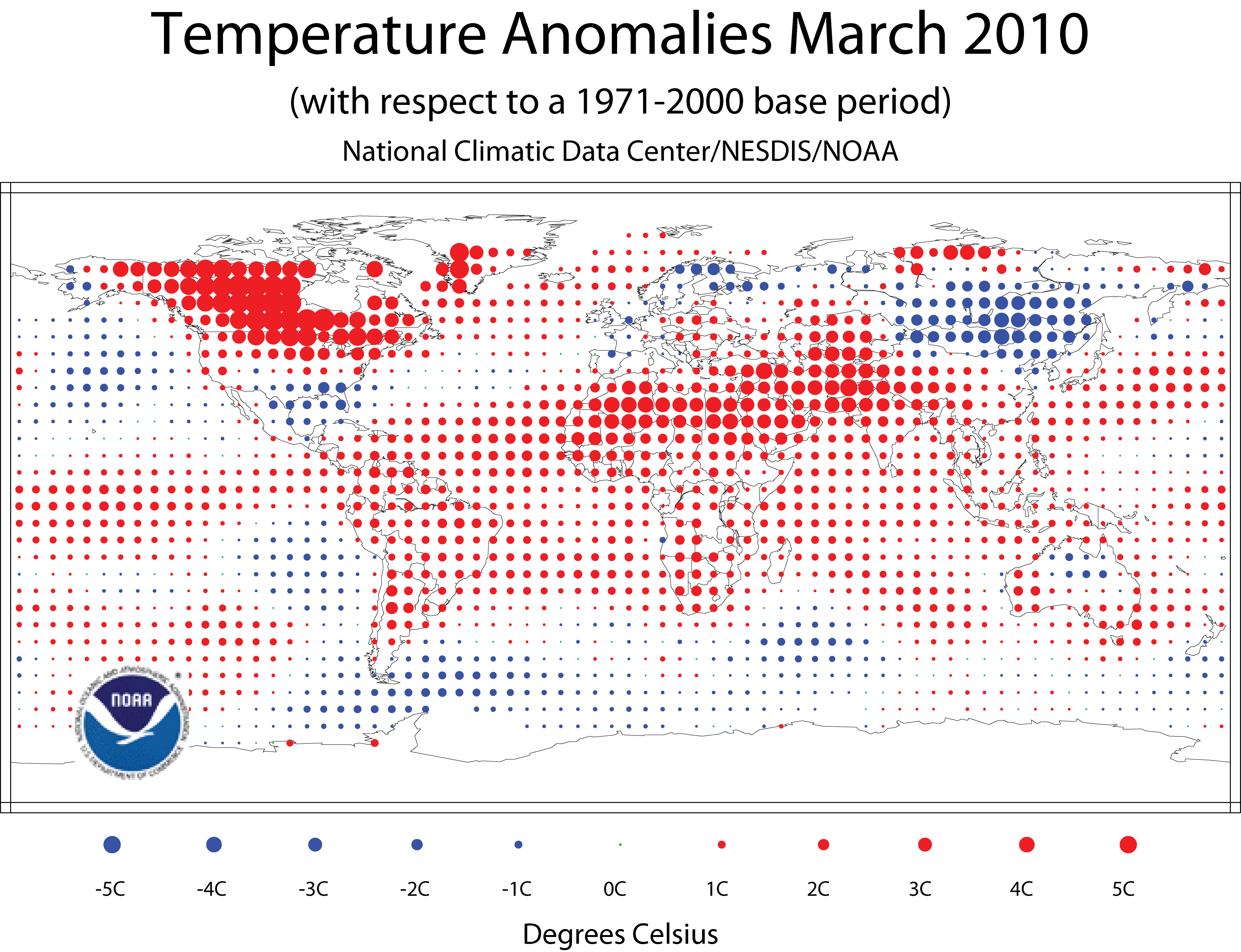
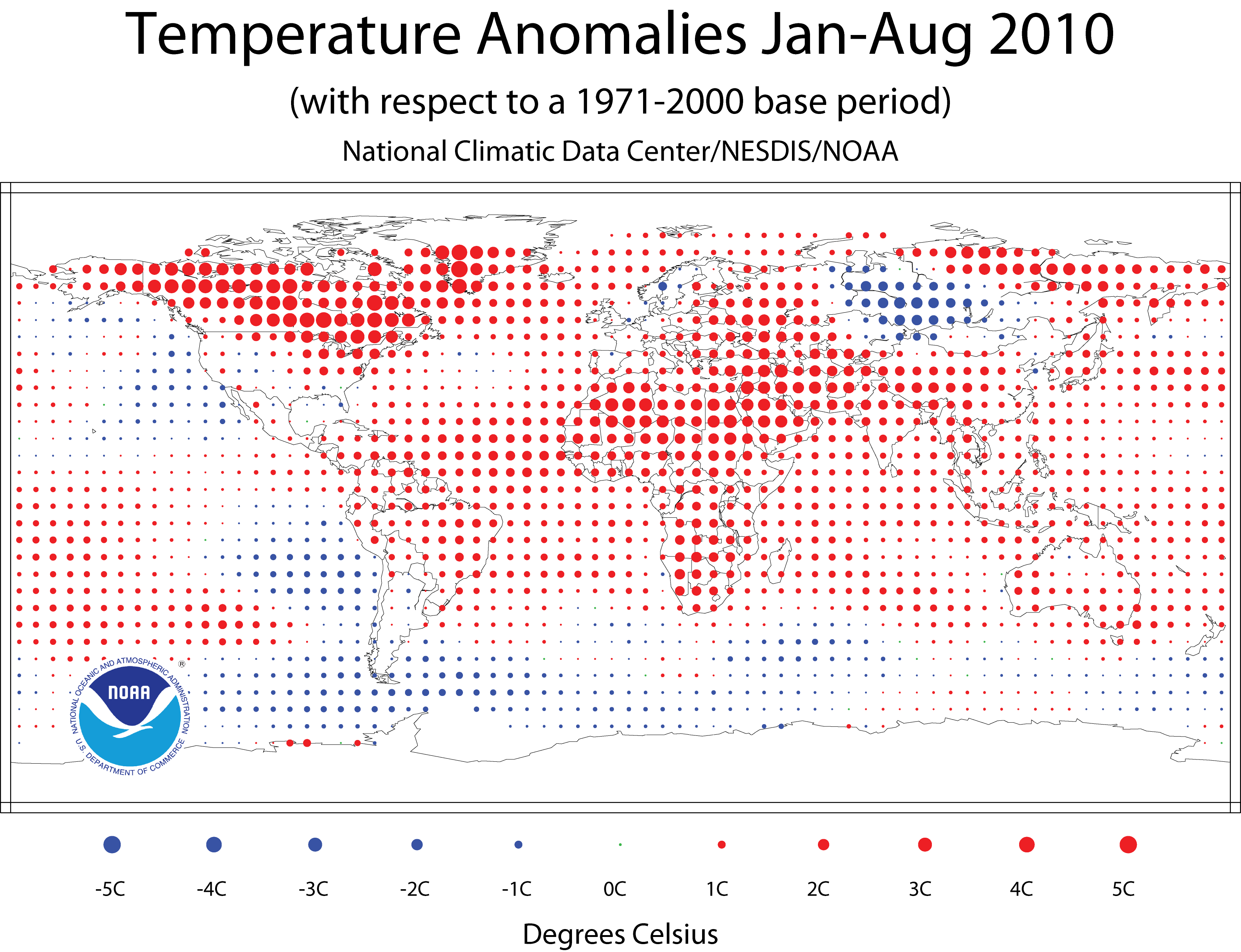
The above illustrations were used to make the basic point about
how to represent temperature trends as 2D. Below are some more
examples using more recent data, which serves to maintain the
trends already seen but makes them worse:
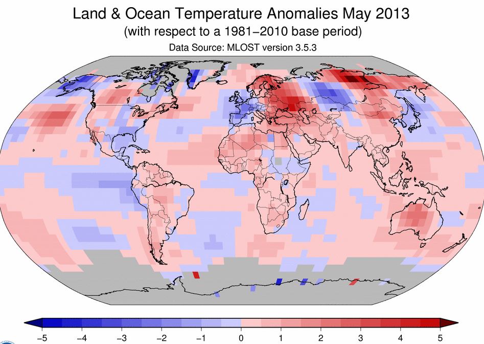
Note that you can make your own maps like this using the
interactive form located HERE (you will do some exercises on Sections on Friday using this interface)
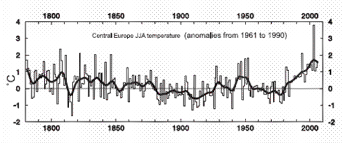
Finally, a new regional climate record has been analyzed in seasonal terms
that have revealed fairly significant summer time warming in Central
Europe:
Conceptually increasing climate volatility can be represented as follows:
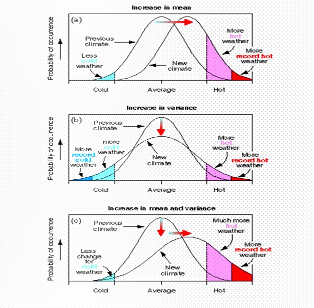
Panel (a) shows the expectation if there is simply if the new climate simply
is a direct shift in average quality from the old climate but the variation
around the average is the same. This is likely to be too simplified of notion.
Panel (b) shows the case where the new climate simply shows more extreme
variations around the same average values as the old climate.
Panel (c) shows the case where there is both a shift in the average and an
increase in the volatility (i.e., variance around the average). That situation would predict the most
amount of record heat.
The observed data is mostly consistent with Panel c.
